Showing posts with label mountains. Show all posts

Iceberg in Mist

Between 1968 and 1970 Gerhard Richter painted a remarkable range of 'damaged landscapes', as they are termed by Mark Godfrey, the curator of Tate Modern's Gerhard Richter: Panorama. These include aerial views of cities in thick grey paint, the colour of ash and rubble, that Richter later likened to images of the destruction of Dresden but which might equally be seen as warnings of some future apocalypse.  One of these, Townscape Paris (1968), is a painting I referred to rather tentatively in one of my very first blog posts here.  At the same time Richter was also painting a very different kind of townscape, reproducing details of architectural models, and these too seem dystopian - windowless blocks showing no sign of life, casting shadows over empty white roads that resemble the patterns on a circuit board.
 

Another monochrome aerial view from 1968, Clouds, provides glimpses of an abtsracted version of the German countryside - imagery that Godfrey compares to the opening sequence (above) of Leni Riefenstahl's Triumph of the Will (1935). Two years later Richter began a very different series of cloud paintings, this time treating them as isolated objects, white against featureless blue-green skies.  They resemble Alfred Stieglitz's famous cloud photographs, Equivalents (1927), which in turn (as Rosalind Krauss points out in that weighty tome Art Since 1900) could be viewed as Duchampian readymades - uncomposed and detached from their environment.  Alps II (1968) might be a close-up of a storm cloud and is barely recognisable as a landscape painting, certainly a long way from the heroic image of German mountains celebrated in those early Reifenstahl films.

Seascape (Sea-Sea) (1970) is described in the exhibition as a 'collage of two photographs of the sea, one inverted to appear as the sky. The painting creates a momentary illusion of a coherent seascape, until it becomes clear that the ‘clouds’ in the upper half of the painting are waves. It creates a sense of discontinuity and suggests Richter’s acknowledgement of the gulf separating him from the moment of Romanticism.' It made me think of Rothko's grey paintings, with the patterns of waves replacing Rothko's brushtrokes.  Mark Godfrey views them as a cross between Capar David Friedrich and Blinky Palermo: an attempt at the kind of radical abstract statement Palermo was making in his Cloth Paintings using the traditional medium of a seascape.  Another point of comparison is Vija Celmins and, like her, Richter also produced images of black and white fields of stars.

In 1971 an exhibition of Richter's recent work, painted in flat colour rather than black and white, prompted various critics to compare him with Friedrich.  Landscape near Hubbelrath (1969), for example, shows an empty view with a road sign where we expect to see, in Friedrich, a church spire.  Richter said that his art lacked the spiritual underpinnings of Romanticism: 'for us, everything is empty'.  However, Mark Godfrey argues that Richter and Friedrich both aimed to create a sense of unfulfilled desire (readers of this blog may recall an earlier post on the way Friedrich composed 'obstructed views').  This approach may have seemed particularly appropriate to a post-war German artist working at a time when the purpose of painting itself was being called into question.

There is one more interesting example of Richter's engagement with Friedrich later in the exhibition, a painting called Iceberg in Mist (1982).  I have mentioned various artists here before who went north to paint the Arctic seas -  Peder Balke, Lawren Harris, Per Kirkeby - and Richter made his own trip in 1972, looking for a motif as powerful as Friedrich's The Sea of Ice.   Mark Godfrey mentions that on his return Richter made 'an extraordinary and little-known book of black and white photographs of icebergs', printed, like the two halves of Seascape (Sea-Sea), both upside down and right side up.  In this way Richter rejected the single sublime image and arranged the photographs in such a way that 'their overt subject became more or less irrelevant.'  Richter's urge to thwart our desire for spectacular landscapes is also evident in the later painting, where we cannot even glimpse the tip of the iceberg as the whole view is shrouded in mist.

Caspar David Friedrich, The Sea of Ice, 1823-4

The waving moorland and the level beach

I have been listening to the audiobook of The Woman in White, read by Ian Holm (whose voice always takes me back to childhood memories of the Radio 4 adaptation of Lord of the Rings).  The novel begins with the narration of a drawing master, who is distracted from the landscape by the beauty of one of the young ladies he is supposed to be teaching. 'The most trifling of the questions that she put to me, on the subject of using her pencil and mixing her colours; the slightest alterations of expression in the lovely eyes that looked into mine with such an earnest desire to learn all that I could teach, and to discover all that I could show, attracted more of my attention than the finest view we passed through, or the grandest changes of light and shade, as they flowed into each other over the waving moorland and the level beach.'  There follows an interesting passage on Art and Nature which I thought I would quote here in full.  You could contrast the closing sentences with the way other writers have taken comfort in the thought that it is the landscape that will outlast humanity (see, for example, my earlier post on Robinson Jeffers).
'At any time, and under any circumstances of human interest, is it not strange to see how little real hold the objects of the natural world amid which we live can gain on our hearts and minds? We go to Nature for comfort in trouble, and sympathy in joy, only in books. Admiration of those beauties of the inanimate world, which modern poetry so largely and so eloquently describes, is not, even in the best of us, one of the original instincts of our nature. As children, we none of us possess it. No uninstructed man or woman possesses it. Those whose lives are most exclusively passed amid the ever-changing wonders of sea and land are also those who are most universally insensible to every aspect of Nature not directly associated with the human interest of their calling. Our capacity of appreciating the beauties of the earth we live on is, in truth, one of the civilised accomplishments which we all learn as an Art; and, more, that very capacity is rarely practised by any of us except when our minds are most indolent and most unoccupied. How much share have the attractions of Nature ever had in the pleasurable or painful interests and emotions of ourselves or our friends? What space do they ever occupy in the thousand little narratives of personal experience which pass every day by word of mouth from one of us to the other? All that our minds can compass, all that our hearts can learn, can be accomplished with equal certainty, equal profit, and equal satisfaction to ourselves, in the poorest as in the richest prospect that the face of the earth can show. There is surely a reason for this want of inborn sympathy between the creature and the creation around it, a reason which may perhaps be found in the widely-differing destinies of man and his earthly sphere. The grandest mountain prospect that the eye can range over is appointed to annihilation. The smallest human interest that the pure heart can feel is appointed to immortality.'
- Wilkie Collins, The Woman in White, 1860
William Collins, the father of Wilkie Collins, 
Children on a Mountain Top, before 1847

The Jack Pine

Painting Canada: Tom Thomson and the Group of Seven is another superb exhibition at Dulwich Picture Gallery, following others I've described on this blog: Salvator Rosa, Paul Nash, Adam Elsheimer.  Reviewers (like Brian Sewell) will inevitably have to provide some background information on the Group of Seven, whose work has not often been seen in the UK.  In Canada, as Ian A. C. Dejardin says in the catalogue, their work has been endlessly discussed 'to the point of exhaustion.  Yet their visual legacy remains supremely powerful: many Canadians, raised with reproductions of the Group of Seven's most famous paintings on their classroom walls, still see their own country through the Group's eyes ... Few of us in Europe could point more than vaguely on a map to any of the locations these artists depicted.  These are painted woods, trees, lakes and mountains only.  Nonetheless, non-Canadians should be aware: we are on holy ground.'  As I know some readers of this blog are Canadian (see comments on my last post...) I'd better admit that a lot of these paintings were completely new to me.  

Tom Thomson in Algonquin Provincial Park, 1914-16
Source (all images here): Wikimedia Commons 

At the start of the exhibition, there is a quotation from Fred Housser, who wrote the first book about the Group of Seven in 1926: "This task [of expressing the spirit of the Canadian landscape in paint] demands a new type of artist; one who divests himself of the velvet coat and flowing tie of his caste, puts on the outfit of the bushwacker and prospector; closes with his environment; paddles, portages and makes camp; sleeps in the out-of-doors under the stars; climbs mountains with his sketch box on his back."  The idea of an artist who 'closes with the environment' reminds me of recent British land artists who have walked in Algonquin Park and other landscapes explored by the Group of Seven.


When Tom Thomson died in 1917, his memorial described him as 'artist woodsman and guide'.  Photographs show him fishing and canoeing; one of these was the basis for Peter Doig's White Canoe (1992) (see also my earlier post on Doig's Figure in a Mountain Landscape paintings).  However, as Dejardin points out in the catalogue, Thomson was actually rather a snappy dresser when out and about in Toronto and he made a point of adding some expensive cobalt blue to the marine grey used in painting his canoe.  In 1919 the wealthiest of the group, Lawren Harris, had a boxcar fitted out as a travelling studio for a trip north on the Algoma Central Railway.  It sounds more comfortable than the floating studios of the Impressionists, but this didn't detain some of the artists: as A. Y. Jackson observed, sitting in the boxcar, 'the other chaps are all out sketching under umbrellas.  They are all trying to turn out four a day and can't stop if it rains.'

 Tom Thomson, The Jack Pine, 1916

Tom Thomson's most famous paintings, The Jack Pine and The West Wind, are shown alongside their original sketches in the exhibition's first room.  Each is a majestic landscape visible behind the drooping form of a pine tree, its branches seemingly surrounded by a faint aura.  Pine trees seem to have inspired poets and artists all over the world so it seems surprising in retrospect that (according to Housser) the Canadian artistic establishment, unable to see beyond European and Hudson River landscape visions, considered their native Jack Pine trees unpaintable before Thomson came along.  There is a Pine Island in Georgian Bay (part of Lake Huron) and this exhibition includes two 1914 sketches of it by Thomson and a night scene by Jackson, where the trees stand over a pool of deep blue in which you can see the reflections of stars.
 
Six of the Group of Seven, plus their friend Barker Fairley, in 1920
From left to right: Frederick Varley, A. Y. Jackson, Lawren Harris,
Fairley, Frank Johnston, Arthur Lismer, and J. E. H. MacDonald.

In 1925 a critic noted that the Group had been 'tree mad', but also, successively, 'lake-lunatic, river-ridden, birch-bedlamed, aspen addled, and rock-cracked.  This year they are mountain mad.'  The exhibition's room of mountain views includes Frederick Varley's Hodleresque The Cloud, Red Mountain (1927-8) and Lawren Harris's stylised, almost art deco Mt Lefroy (1930), although I preferred the more direct, less abstract approach of J. E. H. MacDonald, especially a view of a small turquoise lake in the gathering snow with the Japanese-sounding title, Mountain Solitude (Lake Oesa) (1932).  The final room collects more of Harris's Theosophically-inspired landscapes from the late twenties - radically simplified mountains and ice bergs under grey skies, sometimes parted with shafts of light, reflecting his search for those 'moments in the North when the outward aspect of nature becomes for a while full luminous to her informing spirit - and man, nature and spirit are one.'

Take a Look

I've been painting in soft pastel for over 25 years. Long story short: no room to paint in pastels and an urge to move on. (God given!) I have a staggering pile of over 250 pastel paintings ~ credible, beautiful, fun artwork, bagged up and hidden away in the dark of my art cabinet. Take a look: Paintings for a Song


Corrales Acequia, 9" x 9"

Colorado Contrasts, 9" x 9"

The Mountain That Had to Be Painted

Contemporary artist Iwan Gwyn Parry tackling Arenig in
'The Mountain That Had to Be Painted'

This week I've been unable to do more than collapse in front of the TV after long days at work, so I have appreciated the fact that BBC4 has been showing a Landscape Season.  There has been a lot of outdoor stuff - lakes (Wainwright), mountains (Munro), the golden age of canals and even a documentary on the A303 ('Highway to the Sun').  They repeated Alice Roberts 'titillating middle-aged men' (according to The Guardian) with her wild swimming, and in 'The Great Outdoors' they took 'a nostalgic look at life for campers, twitchers, ramblers and metal detectors'.  I missed the programme on R. S. Thomas (on too late...) but caught another one set in the Welsh landscape, 'The Mountain That Had to Be Painted'.  This was an account of the time Augustus John and James Dickson Innes spent in the Arenig Valley painting 'a body of work to rival the visionary landscapes of Matisse.'  Whilst it did little to dispel the impression that Auguston John's life is more interesting than his art, the programme provided a valuable introduction to the work of Innes, who died (like some old country singer) at the age of 27 from a mixture of TB and wreckless living.  For more on Innes and the Arenig school, see a recent post on the Footless Crow mountain writing blog. 

Earlier in the week there was an hour-and-a-half long history of English landscape painting, 'This Green and Pleasant Land.'  The programme discussed a sequence of paintings from the time of Charles I (Rubens and Van Dyck) down to World War Two (Paul Nash and the patriotic posters of Frank Newbould), with a final leap forward to David Hockney's recent iPhone sketches. As it started we wondered who the extraordinarily plummy-voiced narrator was - Brian Sewell my wife thought, but it turned out to be Simon Callow.  Fearing a rather conservative survey we nevertheless ended up enjoying the eclectic mixture of people they had invited to talk about each painting - from the 'editor at large' of Country Life, who suggested that Gainsborough's Mr and Mrs Andrews could easily be imagined in his magazine today, dressed in Barbour jackets and Hunter wellies, to a foundry manager who said he had a reproduction of Coalbrookdale by Night hanging up at home in the hallway.  It was worth enduring Peter York explaining his fascination for Atkinson Grimshaw in order to see John Virtue discussing Constable and sketching the sea. Will Self was on amusing form recalling the horror of growing up, as the son of a theoretician of garden suburbs, while actually living in a garden suburb ("that'll do things to a child!").  The programme generally covered the key works you would expect, although I was surprised they missed out Samuel Palmer and spent so much time on Stubbs (who I see I've never mentioned here).  All in all, well worth watching if you have access to the BBC iPlayer - available for 6 more days as I write this...
 
 Will Self discusses William Ratcliffe's

CHAPTER FOURTEEN -- ROCKS

(With thanks to The Pastel Journal where this was originally published.)


Rocks and Oaks, 9" x 12"


The world is made of rock, the substance beneath our feet. From the top of the highest peak, across the bottom of the ocean, to the quiet expanse of the desert, rock is the underlying foundation of all. In our haste to paint our surroundings we mustn’t neglect rock, yet people seem to think that rocks are difficult to paint. Many times I’ve heard students lament that their rocks look like baked potatoes or soft ice cream. The cure for such problems lies in selecting rocks that are interesting and have sharp light and shadows on them.

Pick up a rock and hold it in your hand for a few moments. Explore the surface, searching for spots that are coarse and uneven, perhaps interrupted by bumps and holes. Now feel for the smoother areas, sliding your finger around a corner. This may be a piece of sandstone that has been smoothed to a velvety sheen by the action of a stream. It could be a piece of quartz, softly polished to a hazy white as it rolled in the surf. Perhaps it’s lava rock with uneven holes all over its surface, or a chunk of pumice so full of air pockets it floats. Your rock may have been blown by wind, sandblasted to a soft roundness or broken from a larger rock, resulting in a jagged edge. The many colors and shapes of rocks, sometimes adorned with lichen or leaves, offer a solid underpinning that stands in sharp contrast to the supple surroundings of the earth. Whether the angular facets and sharp fractures of granite or the soft rounded shapes of sandstone, the unmoving weight and unyielding hardness of rock must be made clear to your viewer.

To create believable rocks, you must study the characteristic shapes and fractures of the many differing varieties, analyzing their size and texture, fracture patterns and other distinguishing features. Becoming familiar with rocks typical of the area in which you are painting is essential. You might remember the three classifications of rock: sedimentary, igneous and metamorphic. Fashioned in layers, sedimentary rock is made when deposits of various materials are trapped and slowly compressed over time. Igneous, or “fire-formed,” rocks are created when the molten core of magma is extruded through a vent in the earth’s crust or blasted from a volcano and suddenly cooled. Metamorphic rock has been transformed by pressure, heat and water, changing the crystalline structure of the rock itself.

All rocks are shaped by pressure, temperature, erosion and friction. Most notable is the wind that blows dust and sand, smoothing and sculpting rock; the falling rain, flowing water and crashing waves that tumble and carve rock; the scorching heat and sub-zero cold that stress and crack it; and the tremendous forces of rock sliding over rock that pares it away with the ever-present pressure of the earth itself. Time and gravity move and change rocks. They’re slowly pushed up into mountains or sifted down riverbeds and gradually ground away, becoming smaller and smaller. We don’t sense this change because it happens so slowly. Rocks seem stable, constant, firm. It’s this seeming permanence that must first be communicated.

Look for the special way that rocks relate to one another, whether the rocky face of a sheer precipice or a pile of loose boulders that have tumbled together. The weight of rocks causes them to fall to the lowest point possible, often leaning into or on top of one another. Even the rocky faces of a mountainside lean together as one giant cliff, made up of many facets, most often slightly receding as they climb upward. Smaller stones are then slowly sifted into crevices or between and around boulders, creating more visually engaging complexity.


Primary to a successful painting of rocks is some compositional center of interest, perhaps a cluster of appealing shapes accented by strong light and shadow. A pile of dull rocks with dull light on them hardly inspires the artist or the viewer. Search out an interesting outcrop of rocks in your area. This may not be a dramatic scene. It could simply be some rocks in your garden or a few boulders along the road. Photograph and sketch your rocks at different times of day, returning to see how the colors and contrasts change. Note the time of day when sun and shadows are attractive. Familiarize yourself with these particular rocks, learning the intricacies of clefts and the broad swaths of uninterrupted planes.

A shadow crossing over and around a rock more clearly defines its shape as rounded or flat, bulging or smooth. Creeping into fissures and sweeping over planes, shadows often pick out broad niches, rough textures, cracks and other variations that identify these as rocks -- and not as a pile of mashed potatoes. In contrast, mashed potatoes are soft and rounded, with few distinct planes. True, there are rounded rocks, some that even resemble mashed potatoes, but it’s the job of the artist to communicate the hard, unyielding qualities of even these atypical rocks. More often you will paint those that are far more recognizably rocky rocks.

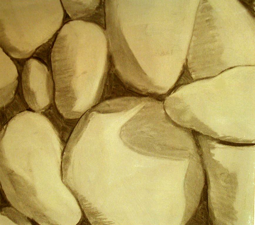
underdrawing, reclaimed Wallis, charcoal
Begin with an accurate rendering of your rocks. If you need to take on the challenge of painting rocks, spend some time looking at, photographing and drawing them. Do an underdrawing or a complete sketch on a separate piece of paper that clearly shows the various planes and details of your rocks before beginning to paint them.

If there’s one aspect that’s key to rendering rocks believably, it’s finding and identifying the planes. Locate three primary planes: dark, medium and light. Where the light strikes most strongly, assign the lightest values. Then select a medium value for the half-light areas, and mark the darkest areas of value where deep shadows occur.

Mass together these value areas into pleasing shapes, perhaps rearranging the rocks in your drawing so that the planes are more clearly indicated. There may be additional values between those you’re using, but simplifying helps distill shapes to their essence. Remember that, generally, light values seem to expand while dark values visually contract, meaning that you may design your drawing using more darks and yet retain a sense of balance.

Observe the colors in each value plane. Most often sunlight bleaches out strong colors, leaving a pale, somewhat washed-out hue. In the shade, rocks are somber and dark, usually lacking in vibrant colors. It’s in the middle tones of the half-light areas that you’ll find the most stimulating colors, depending on the rocks you observe. Think about the colors of rocks in general. Yes, most of us think of gray or beige, which are not inaccurate descriptions. Yet how interested are you in painting a pile of gray rocks? Spend time looking for rocks that have more attractive color, or, better still, challenge yourself to paint admittedly gray rocks using some exciting colors in the proper value range. For instance, in the sunlit area choose pale yellow, pink or peach. In the half-lights use a deeper gold, red or orange, and in the shaded areas use dark brown, maroon or ginger. This can result in rocks that retain their identifying characteristic color yet have spark and appeal to them.

Different rocks are different colors. Consider the great variety of colors found in marble, or the contrasts of sandstone, granite and quartz. Group together a handful of small stones and admire their differing hues, perhaps varying from pink to orange to green. Observe the translucency of one or the striations in another. Notice how they show evidence of wear, some tumbled and smooth, others broken and grainy, and how those diverse textures reflect light differently. See how the colors bounce around in the sunlight, perhaps the glow of a light-colored one feeding into the shadow of its neighbor, making a secondary color that’s a fiery mixture of the two. Studying simple stones can teach you a lot about painting rocks, which can be worthy of painting alone.

It’s best to use a common color throughout the dark, medium and light planes to identify a rock as being made up of a single material. If you select a purple for the shadowed side, be sure to include lavender in the sunlit side. You most certainly will want to layer various colors of the correct value into and over the purples, creating an exciting depth of color, but don’t neglect the identifying color in all the areas of value. Be careful not to paint a rock that’s yellow in sunlight blue on the shadow side and red in the half-light areas or it won’t look like it’s made of the same material. You may choose to contrast colors of various rocks by placing them next to one another, emphasizing the disparity of color or value. For instance, place a purple-hued rock next to one that‘s mainly yellow, or a pale one next to a dark one. To identify a common kind of rock throughout the landscape, utilize repeated colors while retaining a “mother” color, a matrix that defines all the rocks as consisting of the same basic material. For instance, to create the multiple hues found in the Painted Desert choose a mother color, perhaps light rust or dusty pink, and create the muted yellows, reds, oranges and lavenders of the various striations by lightly layering the mother color beneath or on top of all of them.

Shadows can become one of the most fascinating and mysterious portions of your rock painting. Don’t abandoning the dark crevices to a simple line of black. Instead, add deep rich tones of blue, purple or brown. Let the dark planes become lush jewel tones: opulent gold, deep violet, sumptuous maroon and extravagant blue. Darken only the very deepest cracks with an underlying touch of black to heighten the drama there.


Cold River Runoff, 10" x 24"


Standing Sentinels, 18" x 24"

Often rocks are exposed along streambeds and brooks, where the water has cut away otherwise dense foliage. Stony streams abound, though other, similar rocks may lie beneath nearby earth that has not otherwise been disturbed. In rivers the rocks are tumbled and carried along by the action of the water, carved away to show graveled outcrops, ridges and ledges. The action of the water over time has shoved them into relationships with one another, resting together in counterbalanced clusters that resist the never-ending motion. Look for the places where such relationships are clearly seen, perhaps where the boulders and stones lean into one another, surrounded by swirling water. Wet rocks can be exquisitely beautiful. Submerged rocks glisten like multicolored gems. Even rocks that are splashed by a stream show spectacular colors where they’re wet, darker in value and richer in saturation, in contrast to the slightly duller colors and paler values of the dry portions. Again, be careful to retain the overall sense of one color flavoring rocks that are both wet and dry, shifting the values and brilliance of the colors only.

Details can enhance your painting of rocks. The half-light area is generally the plane where most of the details reside. Use lines to draw the eye to a gap or fissure, texturing the surface to make it appear rocky. Don’t over-detail all the planes of the rock, which will destroy the illusion of light and shade. Remember that bright, direct sunlight washes away details in its glare, much like an underexposed photo, just as darkness does in an overexposed one.

Use soft strokes of green foliage to enhance the bold angularity of rocks. The generally warmer colors of stones contrast pleasingly with the cool colors of grasses, bushes and overhanging trees. Even in the parched desert, where rocks prevail, a touch of green refreshes and focuses the eye, pointing to an area of particular consideration.

Rock Pool, 9" x 12"
Study the distinctions of rocks while noting their similarities. Like people, rocks share common characteristics while remaining unique. Enjoy the disparity but search out those universal elements that will help you speak clearly of rocks in your paintings. Find the angular planes that identify this as a rock, distilled to three values to begin. Choose a common color, from light to dark, to create the illusion of one material in all of the value areas, while adding beauty with layers of colors and details that indicate the individual character of this stone. Keep the interest in the half-light areas, where color and detail most often reside. Stop and look at a rock in the same way you might examine a person’s face, appreciating its distinctive beauty.

ROCKY CLIFFS

Painting rock cliffs involves the same rules for painting rocks in general, but in a larger upright plane. To visualize the rules mentioned here, think of the rock faces in a canyon, such as those you find in the Grand Canyon.

As always, I recommend you do a good underdrawing in charcoal on the toned sandpaper, sorting out all the planes of the rock. Find the relationships of the cliffs, how they run into one another and change angles, how the details of light and shadow show depth.

A Place for Gold, 18" x 24"
Start with three values. Find those rocks that are darkest and be sure to get them in place, then look for the medium values, usually where the most color will reside. The lightest values may have to be implied or drawn in with a lighter pastel pencil if you are starting on a dark-colored ground. Be sure you understand where all the various planes of the rocks lie. Look for characteristic fractures, striations and places where wind has worn the rock smooth. Draw in any holes, caves or hollows using light and shadow to indicate them. Draw stains and chelation (where salts have risen to the surface) accurately in order to paint accurately. This is the part of the process where you can resolve any difficulties, simplifying anything that is too complex for you to portray.

Because cliffs are large and upright, usually they will face into or away from the sun to one degree or another. This means that you must identify the direction of the light and stay consistent throughout the painting. Remember that the angle of the sun remains the same, though various rock planes may jut into it or be deeply hidden from it. Shadows have no random shape of their own so be certain that the angles of the shadows and light explain the various rock planes to your viewer. Shadows shouldn’t be too black. Be sure to make them colorful, using a variety of dark blues, browns, reds or purples. Don’t let sunlit areas become overly chalky and whitish in color.

The cliffs may be any color, but around New Mexico we find red rock cliffs. If your cliffs are red you have a chance to use a large variety of pinks, oranges, purples and yellows, even greens and blues. If your cliffs are gray be sure to construct grays using complementary colors in your palette (red and green, blue and orange, yellow and purple combinations) rather than picking up your gray pastel first. If, after layering them or using them as broken colors, you haven’t arrived at a good gray, it’s perfectly acceptable to use gray very lightly over the top, allowing some of the other colors to emerge.

Use characteristic vegetation in your painting to soften edges and contrast with the rock cliffs. Be careful not to obscure too much of the cliff with trees or other vegetation or you’ll lose the continuity of the rocks. Pay close attention to scale. Nothing destroys the illusion of depth like a strangely out-of-scale tree or bush.

To give the illusion of space in your rock cliffs you must remember the laws of aerial perspective. Blue each color slightly and lighten it as it recedes from the eye. Soften edges and diminish details in the distance, and lessen value contrast in the distance. Save the interesting details for the foreground rocks.


Sandia Sunlight, 12" x 18"

CHAPTER SIX -- MOUNTAINS

(Originally published in The Pastel Journal)

Massive mountains loom on the horizon, a pale purple-blue backdrop to the hills and fields before them. Although they’re still thirty miles away, the jagged peaks are vividly etched against the soft blue sky. Shadows flow across the slopes, defining the repeated folds, a ray of light picking out the blue-green of a distant hillside. Mountains define the western skyline, rising from the high plains to altitudes so high that the uppermost reaches can be decorated with snow year-round. These giants set the stage for the drama of the West.

Mountains can pose some unique challenges to the artist. Doing a complete study so that you come to better understand the unique aspects of these massive ranges allows you to resolve such issues as scale, form, value and detail. This can be done as a separate sketch or as an underdrawing.

Charcoal underdrawing
The issue of scale is often the toughest to sort out. The inexperienced artist sometimes decides that in order to show the massive mountains she should try to fill the entire picture plane with nothing else. Mountains crowd the scene, with very little sky or foreground, but become oddly dwarfed by the context, or the lack of context, of the painting. Instead of massive crags, these appear to be mere hills. This is in part because surrounding elements serve to show the grandeur of the peaks. In a framework of sky and foreground, relative scale becomes apparent. Without elements to compare to the mountains, the viewer has no grasp of their size and will often assume they’re far smaller. Including clouds above or trees and grass in front, or both, gives the viewer a comparison by which to grasp the scale.

It’s best to have a good understanding of the form of the mountains you’re painting. Form, of course, is the three-dimensionality of an item. It shows depth, as well as height and length, making a triangle into a pyramid. In the case of mountains, the ways that peaks and valleys interplay -- close and far, large and small -- as well as the light and shadow that indicate these factors, add to the form. As you lay out the composition you’ll usually begin to perceive these forms in greater detail.

It’s a good idea to think about how the mountains you’re painting were fashioned over time. In the West, tectonic forces have thrust up the mountains, and continue to do so as continental plates slowly converge and slide atop one another. This seismic shift, which creates some of the largest mountains in the world, often results in a softer slope on the side of the range where the plate has been lifted. These more gradual slopes are gentler and often covered with trees. On the opposite face of the range the edge of the plate is exposed as it has been thrust into the air, creating sheer, sharp outcrops and crumbling rock faces. This exposed edge may reveal striations in many rich and subtle hues of gold, orange, red and purple running along the course of the range. Look for those places where a particular kind and color of rock takes up farther along the chain, repeated at similar altitudes, though often angled downward from the axis of the break.

Mountains are subject to the erosion caused by wind and rain, which wears away softer types of rock, leaving harder rock exposed. The granite faces of Pike’s Peak in Colorado have outlasted surrounding rocks unable to withstand eons of erosion. Often granite can take on a particular pinkish color, giving a fiery glow to mountains such as the Sangre de Christo (Blood of Christ) range in New Mexico, named for the almost blood red color these peaks become at sunset.

Dry and Cool, 12” x 18”

Occasionally an area of the earth’s crust will be thrust up into a large dome shape but because the seismic forces are somewhat less severe the crust does not crack and split apart. This results in softer rolling ranges such as the Black Hills of South Dakota, which can include extremely colorful rock layers that remain at remarkably similar altitudes. Again, look for ridges of rock linking neighboring mountains with their stripes of color.

Sometimes as the huge blocks of the earth's crust are tilted upward or are completely turned over by tectonic shifts, they push up along a fracture line or fault, resulting in ranges such as the Sierra Nevada in California. These chains have piles of loose rock deposited at the base by the scraping motion of the movement that created them, and often have a rough, jagged line of peaks, such as those characteristic of the Grand Tetons in Wyoming, or other areas where spectacular rock outcroppings occur.

When you paint recognizable mountain ranges -- those that have identifiable shapes such as the bold geometry of Half Dome or the Tetons’ toothy skyline -- it’s best to include characteristic natural elements and indigenous vegetation in the foreground. In other words, don’t put a saguaro cactus into the high regions of the Tetons, no matter how much you need a vertical element.

Often when the artist begins a detailed underdrawing of the peaks and valleys found in a mountain range she finds that she cannot tell what lies in front or behind, whether the mountainside continues to descend or begins to rise in one particular place. Rather than becoming blocked by this, unable to go on with the drawing, she must take matters into her own hands and simply decide. Unless you’re painting an extremely detailed exploration of every peak, no one but mountain climbers will argue with you. However, when you’re painting an identifiable and familiar mountain chain, be sure to conform relatively closely to the specific shapes and spacing of the crests.

South View, Placitas, 18x24”

Due to the effects of aerial perspective, certain elements begin to change as mountains recede toward the horizon. First, and most noticeable, everything becomes cooler in color and lighter in value. The intensity of warm colors fades. Detail is slowly lost, edges soften and the contrast in value diminishes. In his book Carlson’s Guide to Landscape Painting, written in 1929, respected art instructor John Carlson explains that as one looks sideways through the progressively thickening atmosphere it’s as though there were curtains of air hanging at regular intervals, like veils through which you see. Another way to picture this is to think of one-square-mile blocks of slightly bluish air stacked sideways and upward, filling the distance. The farther away an object is, the more blocks you must look through and the paler and bluer things become, until the most distant range of giant mountains is reduced to a mere line that’s nearly sky blue. Leonardo da Vinci, the consummate eyewitness of physical effects, noted this bluing of objects with increased distance. In the 1500s he observed that if an object “is to be five times as distant, make it five times bluer.” His advice still applies today. The only exception to this visual rule is white. In the distance white becomes slightly dull and warm, a pale pink or yellow. Distant snow isn’t the same bright white as that in the foreground. Clouds atop far peaks are somewhat yellowed by distance, enhanced by pollution. The values of all colors become paler in the distance. For instance, although you know that the mountains in the distance are made of the same rock, with the same trees, bushes and meadow grasses as those closer to you, the values appear muted and grayer. Test this by squinting your eyes so that the distracting color fades away.

When painting mountains, begin by carefully selecting the proper value for the entire mass, and then delineate the slight differences in value seen in each range, adhering closely to the original value mass unless there’s a great jump in distance. It’s very easy to fall into a little trap when painting mountains. The general value of mountains is medium-dark, which means they’re not as light as the sky or as dark as the trees, and are slightly darker than the medium-light of the ground. However, as you paint downward from the sky, you usually encounter the mountains next, and have no basis to compare values. This means that until you establish the value over the entire piece you cannot adequately decide the correct value of the mountains. They almost always seem to be too dark at first, but are easily lightened in pastels. Additionally, while we generally assign mountains a medium-dark value, this usually refers to the tree-covered lower slopes. In fact, the rocky faces of the high mountains of the west are often a medium value due to the color of the exposed rock, sheer cliff faces and the lack of trees.

No matter what the conditions, whether seen through the warm, hazy light of summer or the still clearness of a cold winter day, whether high and clear or viewed from lower altitudes, mountains form the breathtaking backdrop to so much of the western landscape. You can meet the challenge using careful observation and soon master the colors and values of the irresistibly beautiful mountains.


Silverton Summer, 9x12”

All of the paintings shown are available (subject to prior sale.)