Showing posts with label sky. Show all posts

Big Boss Season 5 Winner :Juhi Parmar


Juhi Parmar the famous T.V star, age 31 was declared winner of the Big Boss season 5, while Mahek Chahal was the first runner up. Juhi defeating actors Sky,Sid, Amar Upadhyay and dancer Mahek  won the season 5 crown and one crore prize. Juhi said the main reason of her winning the Big Boss show was the honesty which she showed in the show, she didn't played any politics in the game. The grand finale of Big Boss season 5 saw some stunning performances from Sunny Leone , Rakhi Sawant and Malika Arora Khan. Juhi became the second woman to win the Big Boss show and was from day one in the house and remained there in the house for  98 days .Juhi made great friends in the house like Sunny and Pooja Bedi ,while Sky became her brother. Thus her friendship with Sky and Pooja Bedi helped her to win this show. Sid and Sky were the most entertaining of the show because of their fights which drived people to see the show and give their comments , while Mahek wild card entry also appreciated by many people. After seeing many sites and seeing comments on them , I can say that Sid and Mahek were the favorite choice of the people but my favorite was Sky. 


Sky

Sky

CHAPTER TEN -- NIGHT

(With thanks to The Pastel Journal, where this chapter was originally published.)


Nighttime City, 17" x 23"

Evening scenes intrigue us. Darkened skies allow soft shapes and patterns to emerge from shadows as the eye is drawn to the glimmer of warm lights amid the cool colors of twilight. The night reveals only some details and allows the mind to complete the picture. The subdued light and softness of evening evoke a certain mood in a painting. “In the shadows the mysteries dwell,” mused Leonardo da Vinci. However, in painting the night, darkness is always defined by the light.

Night paintings are low-key in value and color, often with areas of brilliant light to draw the eye. The use of powerful darks -- deep but colorful -- can strengthen a painting, while areas of light allow vivid medium and light colors to punctuate the dark. The night sky is cool, and headlights or city streetlights interrupt the darkness, unless the moon rises to cast its soft glow over the landscape. A fleeting sunset lends ethereal colors to the sky as the blush of color from the setting sun lingers for a few minutes and the lights of the city begin to twinkle in the distance. Stars and clouds decorate the night sky, setting the mood for the painting. These can be especially vibrant subjects. Night offers different challenges and much beauty to the artist.

SHIFT IN CONTRAST

To paint the night it is necessary to shift the contrast of the painting into a quieter mode, allowing the darks to dominate, yet not neglecting the light areas that are the backbone of a nighttime painting. Of course, without light nothing can be seen. No matter what the subject of the painting, it is the light that we must paint.

The saying, “in the dark all cats are gray,” illustrates the problem one encounters. In the dark, the sensitive cells of our eyes become less responsive to color and we rely far more on value-related black-and-white vision. This is the reason we have trouble finding two socks of the same color in the early morning light of the bedroom, unless the choice is solely of black or white. In dim light color becomes muted and dull, intensity is subdued and all colors take on a slightly grayish cast. However, this graying and dulling of colors in the dark is what allows the intensity of light to work in a painting. The blaze of light attracts the eye and reveals the colors.

So how can we make interesting and lively paintings of the evening? First we must change the value range in the piece. Instead of relying on the usual dark, medium and light scale of a normal daytime scene when the daylight is creating many medium values throughout the painting, we use a narrower range of dark and light only. The medium values and colors become much less visible except where there is light cast on the subject. Everything in the dark stays fairly dark and only those things in the path of the light are bright in color. This higher contrast of dark and light can make a strong painting.

USING STRONG DARKS

The majority of colors used in a night painting will be dark, so begin there. Use a variety of subdued shades, layering them together to form fascinating colors that are interesting and deep.

Do not depend on black for the dark areas. Although black may be layered beneath colors to achieve the desired shade, it tends to be a cold, stark color when used alone. Vincent van Gogh once wrote about his painting titled Café Terrace, ". . . here there is a night picture without any black, nothing but beautiful blue and violet and green, and in those surroundings the lighted square is colored sulphur yellow and limey green.” As van Gogh did, use beautiful colors -- deep, dark blue, green, purple or red -- layered over black or atop another to make pleasing and vibrant darks.

Your colors need not all be cool, though most will likely contain some cool notes. Remember that your nighttime painting will utilize a lot of dark colors, so work to make them a strong portion of the piece, whether warm or cool.

Spend time outside at night observing how much color you can see. Notice the fascinating darks and how they are made distinct by light. Look for the colors you might use to make a painting -- dark and light. See how medium values exist only in well-lighted areas, and note that streetlights have a slight halo around them in the dark.

Night Street, 12" x 9"
USING STRONG LIGHT

Areas of light can occur as pinpoints in a night scene, such as streetlights or car headlights, or as a broad pane of light in the window of a house, so it is necessary to carefully compose using them. It is easy to end up with a piece that looks spotty, with points of light scattered in a disjointed way across the painting. Design with the thought of how the viewer’s eye will move through the piece.

Remember that the area where the lightest light and the darkest dark come closest together will draw the eye first and become the focal point of the piece. Sometimes in a dark painting the largest area of light will become the focal point, such as a large window where the light pours out. Be sure in either of these cases that the visual pathway formed by any other points of light compliment and reinforce this focal point, rather than draw the eye away.

Light areas in a night painting are the perfect place to use exciting colors, such as the sulphur yellow and lime green of the lighted square in van Gogh’s painting. The contrast of dark surrounding the light accentuates it, making it a special feature of your painting. Different kinds of bulbs cast light of varying hues. Incandescent bulbs are warm and yellowish, fluorescent light is generally cool and neon light is intense.

All bright lights at night have a slight halo, a softening of the edges where the light seems to hang in the air. The night air is somewhat moist and this vapor holds the light inside it. The larger the light and the wetter the night, the bigger the halo tends to be. Technically, you can achieve this effect by saving an area in the dark plane where the light will be, then laying in a medium color, perhaps a red, and blending it slightly into the surrounding darkness. Then add a layer of a medium-light color, depending on the color of the light itself, and allow the color beneath to show at the edges. A final touch of the lightest color in the center, usually very light yellow or white, simulates the brilliance of the light shining in the darkness.

THE NIGHT SKY

Theoretically the night sky, when it is without the moon, stars or clouds, is a velvety deep black. Once again, flat black is not your best choice. Try using deep purple, dark blue and black, even adding a touch of the darkest green to the mix. Starlight can add a touch of violet to the darkest sky.

Even at night the sky is still slightly lighter in value compared to the darkened land plane, though it will not be the lightest value in the painting if there is a light source showing. The evening sky appears somewhat lighter than you think, especially in the early twilight. Carefully choose the value of the night sky, using colors from the cool side of your palette.

The night sky has a cool cast to it. No matter what color you decide to use, all colors are flavored with a bluish tone. At sundown, make yellows slightly green, pinks somewhat violet and greens bluer in hue. Remember that the darkest colors are at the top of the sky, highlighted by sunlit clouds beneath or punctuated with evening stars.

Let the glow of sprawling city lights in the distance, or the radiance of the soon-to-rise moon, illuminate the sky a bit, revealing mountains, hills, houses or trees in silhouette. The radiance of a mass of city lights can brighten the night sky to almost daylight proportions. Structure this kind of painting so that darkness hangs between the buildings, allowing the lights to shine brightly.

Night Overlook, 9" x 12"
THE MOON, STARS AND CLOUDS

The moon can be a delightful addition to the night sky in your painting, though its brilliance against a velvety dark sky can be arresting. Early in its trip across the sky, the moon can appear quite large and very yellow because of the magnifying effect of the atmosphere on it as it rises. When painting this, be sure that the high contrast of the light moon and dark sky contributes to the composition without becoming distracting.

Moonlight, even when the moon itself is not included in the picture plane, can define the characteristics of the landscape, describing hillsides, trees or buildings. Contours and shapes emerge from the darkness, muted by the night, cool in color, but still describing forms. Sometimes moonlight will be reflected off of particularly light objects and cast a secondary shadow. Look for light bouncing from a white building or wall and casting a deep shadow behind the foliage next to it. In deepest dark such secondary shadows do not exist.

A starlit sky may be a velvety dark violet or may softly glow dark purple with pinpricks of light floating in it. Use soft pastels in medium-light colors for the majority of stars, reserving the lightest color for the brightest stars. Remember that the light from the stars has traveled a great distance and is not the lightest light in the painting. When painting stars it’s best to keep in mind that fewer stars add more visual impact.

Clouds can add a blush of color in a moonlit sky, sometimes iridescent as mother-of-pearl, sometimes warm or cool gray. They serve to soften the shine of the moon and lend mood to a painting. They can foil the brightness of the sky, focusing the eye on the land plane instead.
Night's Colors, 9" x 9"
SUNSET SKIES AND CITY LIGHTS

Sunset skies, when the atmosphere is alive with a blush of color for a few minutes, can add interest and sparkle to your paintings. The light level has diminished enough that the value contrast is reduced, adding the chance for city lights shining against the medium-dark colors of the land.

The darkening sky is very bright at the horizon as the sun dips below the land plane and the angle of the light is increased. The zenith of the sky may be dark enough that, even as the sun sets, there are stars beginning to sparkle overhead.

City lights in the distance can be a particularly interesting subject to paint. Observe such lights carefully, noticing how streets lined with stoplights, brake lights and headlights line up to form yellow or red streaks. Study how the sizes of the points of light indicate distance, the smaller pinpoints farther away. Look for red and white lights on the tops of hills or buildings, at the highest point. Indicate the sprawl of the city and the interruption of the hills, mountains or rivers with the pattern of lights. Include trees and other foliage amid the lights, which helps to illustrate the contours of the land. Add touches of red, green, yellow or orange from business signs, taillights and neon signs.

Night paintings can be a delightful challenge to paint. The contrast of the somber and the spectacular can be captivating, giving you endless opportunities for paintings. From city scenes to moonlit night skies, to the starry sky decorated with clouds, keep the mystery and mood of night paintings in mind and let the light define the darkness.


San Diego Fires, 9" x 12"

CHAPTER NINE -- SUNRISE, SUNSET

(With thanks to The Pastel Journal, where this chapter was originally published, with additional material included here.)
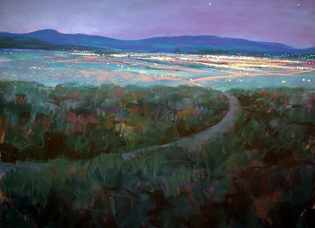

The Edge, 18x24"


For decades, many an art student has been told that painting a sunset is a waste of time and talent, overused, hackneyed and stale, an exercise in the unimaginative. Yet who has not wished, at least secretly, to paint the fiery sunset over the plains or the delicate colors of a summer sunrise, inspired by its natural beauty? Artists want to share that momentary experience, to paint the exhilarating colors, yet this subject is relegated to the child who is considered too unsophisticated to know it is merely a “formula” painting.

How can we redeem a subject that has been so thoroughly rejected by jurors, professors and art critics? Perhaps we must come at it with more than the eyes of the child, ready to paint the breathtaking splendor of a new day or the glory of its finale. To meet the challenge of making a painting that is not simply a trite recipe or a reiteration of what has already been done, takes a little thought and planning, and the willingness to respond to what is there and take a few chances as you paint.

Paramount to painting a sunset sky that is not commonplace or overly romantic is the need for careful composition. Design your painting so that it has a center of interest, a reason for existing beyond being another beautiful sunset. The colors may have been spectacular, but ask yourself what particular vision you bring to this painting beside color alone.

When was the last time you tried to paint a sunset on location as it happened? Most artists rely on a photograph to paint such a fleeting moment in time. Things change quickly at that time of day and a photograph can capture the rapidly changing sky colors and cloud patterns.

However, if the last roll of photos you took of the sunset or sunrise ended up as a lot of washed out colors with hardly any contrast, you might need to increase your skill with the camera. That said, it is best not to rely on the camera entirely.

First you must record the colors in your memory. Pay close attention as you watch the fleeting changes in the light. Remind yourself that the blue of the sky was almost green at the horizon or that the shadowed clouds were a delicate lavender color. Name the colors out loud, if you can, and resolve to remember them.

Practice seeing. Try “painting” the sky in your memory, rather than simply using the photograph as a resource. As you develop this habit, looking at the photograph will increase your ability to recall the colors you actually saw while there.

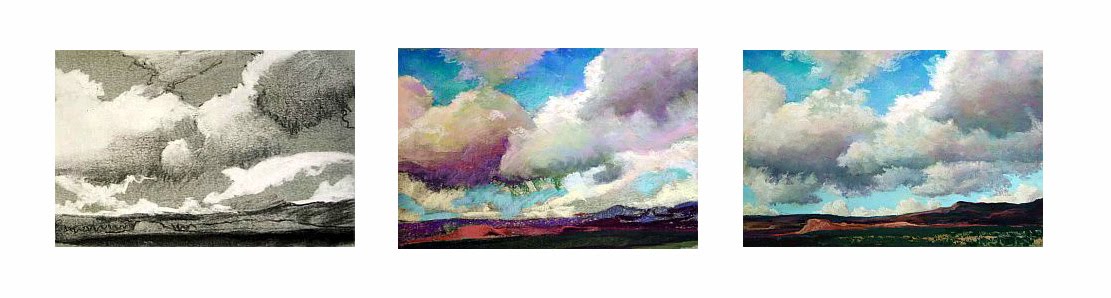
You might also make some rapid line illustrations with notes on what you observe. Quickly draw out the patterns and jot things down, perhaps recording the color of the sky at the horizon and over the tops of the clouds, or the progression of colors as they move upward from the horizon. Note the color of the clouds where the sun shines through at the last moment, perhaps bright orange, salmon pink, magenta or gold. List the layers of colors you might put down, such as deep yellow gold, medium yellow orange and pale orange, to describe how you might approach painting that color. This line drawing is only to remind you of what you saw and may not mean anything to anyone else. Develop your own shorthand for what you see and use it to aid your memory.

As difficult as it might be to set up and be ready to paint on location before the sun rises or sets, color sketches made as it happens can help you see and remember details more precisely. Ask a companion to photograph the sky as you make your rapid color sketches on location so that you have line drawings, color sketches and photographs to refer to when you are ready to paint a finished work in the studio.

One thing significantly different about a sunset or sunrise is that the angle of the sun is below the clouds, rather than lighting them from above as in the daytime. This means that the bottoms of the clouds become light and colorful, while the tops are cast into shadow. This reverses the usual order of “warm on top, cool on the bottom” and sometimes casts shafts of shadow or rays of light into the clear sky. These can be very challenging to paint, but it may be worth the effort to develop a technique to depict them.

Molten Moment, 12" x 18”
Remember that clouds are composed of water droplets or ice crystals that tend to bounce the light around inside them, making them glow. Even in shadow, clouds will have some light within them, showing their volume. Don’t miss the way shadows wrap around a cloud, giving a sense of shape and showing how they overlap one another.

Often you will see a “silver lining” when the cloud is almost directly between you and the sun. This brightly lit edge will usually fool the camera’s eye into over-darkening the part of the cloud obscuring the sun, but notice how in reality soft light is held inside. However dark the cloud is in shadow, there is a sense of the light inside.

Look for places where a hint of sky comes through the cloud, giving it a cool, airy quality, as if it is somewhat insubstantial. These sky holes and sheer spots make your clouds appear to float in the sky, suggesting the billows caused by the wind. Use small touches of sky to move the viewer’s eye to your center of interest.

One caution: The destination of the painting will almost always be the ball of the sun if it is just above the horizon. Like a road or other visual pathway, the convergence of color, light, contrast and detail at the apex of the setting or rising sun is an almost unavoidable visual target. If you do not want that as your center of interest, risking the label of trite or ordinary, do not include the ball of the sun itself in the image. Let it dip below the horizon instead, as you draw the eye to another focal point.

Why is the sky red at sunset? We know that sunlight contains all colors in the spectrum. The atmosphere around our earth scatters the light, usually resulting in the short-wavelength blue of daytime skies. In the evening the sunlight travels through much thicker atmosphere as the sun drops on the horizon, allowing the longer wavelengths to be scattered by dust, smoke and other small particles in the air. The result is that first blue, green and yellow light are slowly filtered out, leaving orange and red. You will see the most spectacular sunsets during times when there are dust particles in the air, such as after a volcano has erupted or when there are water droplets scattering the colors.

The colors of the sky change accordingly, depending on the amount of daylight remaining and the location in relation to the orange-red of the setting sun. Color hangs in the sky in an arc around the setting sun, yellow nearest the sun, becoming progressively more green and blue, finally blending into the dark purple of oncoming night.

Here is your chance to use some long-neglected colors -- brilliant orange or piercing magenta -- colors you love but hardly ever pick up. You may enjoy using bright, out-of-the-tube colors that have been ignored in your palette. Lather the sky with neon green and drench the clouds in luminous yellow. Be adventurous.

Mud might result, but only if you mix widely varied temperatures together too thoroughly or over mix complementary or tertiary colors. You can keep colors fresh by using strokes that remain somewhat unmixed, so that the colors and layers remain lively and vibrant.

This does not mean that you should avoid using complementary colors. Rather the opposite -- the deep blue and brilliant orange standing side by side may be what gives the scene pizzazz. It’s the contrast of fiery red and pale green, fragile yellow and rich purple that brings expression to your painting. Only be careful to retain the authority of each color, rather than over-blending them into a frowzy, run of the mill gray.
Smoldering Moment, 11" x 22"
But there is a place for beautiful grays in your painting. Look for the way neutral colors in the clouds enhance the stunning, clear colors of the sunlight. Take care not to allow the grays to become gloomy or ordinary, which will detract from your painting. Instead, make them a subtle and interesting blend of colors in the painting, perhaps carefully layering colors to achieve a gray using a mixture of lavender, green and peach. An interesting, quiet gray can be the perfect foil for the louder colors you wish to feature.

Sunrises tend to be soft and delicate, quieter in color than a sunset. The clouds may be wispy, not yet raised up by the heat and wind of the day. Often the contrasts are muted, juxtaposing fragile, pale grays with watery pinks, yellows and blues. The sky is often a calm, agreeable blue made by layering the palest hues of turquoise and cobalt. The same spectrum of colors exists around the rising sun as those at sunset, yet they seem not to have the same fire or heat.

At sunset, when the dust of the day has scattered the light into a riot of colors, great contrasts might be seen, often incorporating deep darks where dense clouds have been formed by wind and moisture. Try using rich blues layered to create the impossible, deep green-blue-purple of a sunset sky against which colors explode.

One tool that is quite useful for manipulating clouds in pastels is called a Colour Shaper. This gadget has a rubber tip that can easily grab colors and move them around, much the way a paintbrush does. For small, delicate details, nothing beats a fresh, quick dab using the flexible tip to lift a bit of the blue of the pale sky at the horizon and place it in the midst of the dark purple clouds at the horizon, or to grab a touch of lavender-gray cloud and deposit it amid the cool, clear sky. It helps to wipe the tip on a paper towel or rag to remove colors between strokes and keep them clean.

Although the camera will almost invariably reduce the foreground to a mere blackened silhouette, do not neglect this area in your painting. The ground plane is still an integral part of the painting, even if it is darkened. It needs to be more than a black paper cutout shaped like a mountain or tree.
The setting sun often highlights the land, as well as the sky. Look for the colors of the sky cast onto the intervening landscape, as well as shadows created by the light. You can use simple shapes to make a range of darkened mountains or an intervening line of trees, using dark greens and blues, or add a blush of dark pink, deep maroon or velvety gold to a field in front of dark hills.

At sunrise the land plane is very dark before the sun actually rises over the horizon. However, though that is a dramatic moment, sunrise is not ended at that point. Spend a while studying how the land colors change from the first blush of morning to the full sun of daylight.

Take a few chances as you paint the sunrise or sunset. Often the clichéd sunset painting disappoints because the artist fails to try something new. Experiment with a different kind of paper. Try making your own surface. Paint on an outrageous color or on black paper. Turn the painting upside down and look at it as a series of shapes and colors. Reverse the colors, painting in complements first, then revert to the natural colors -- just to see if it makes your color more exciting. Paint a series of pieces from the same photograph or color sketch on several different colored backgrounds to see how the ground color affects the painting.

Have some fun. Take some risks. Try a few new things. Push yourself a little and get out of the comfortable rut that results in a formulaic painting.

Above all, compose your painting so that it is interesting and varied, not the same old approach of a flaming sky over the silhouette of a black mountain, the ball of the sun caught forever as it tops the peak. This is a stale approach to a potentially brilliant composition. Do not rely on the subject matter alone to make the painting.

Instead, make your painting technically superior. Look for a striking composition that transcends the standard “pretty picture.” There is an underlying abstraction to any painting, especially that of an early morning or late day sky. This is a time when things flow and change rapidly, allowing you to choose those parts that will enhance your composition. Judge the negative and positive shapes, analyze the contrast of colors and values, the juxtaposition of brilliant colors with grays, the movement of the eye through the elements, the contrasting textures of the land and the sky.

The childlike part of the artist longs to communicate the grandeur of the sunrise or the majesty of the sunset. The formula can be surpassed when the artist responds to the urging of simple beauty using what she knows, pushed by experimentation, resulting in originality. This is the place where creativity lives, disciplined by experience and skill, allowing the artist to express wonder artfully.

Morning Glow, 12" x 18"


CHAPTER EIGHT– CLOUDS

What could be more beautiful than the elegance of delicate clouds decorating the soaring blue sky? However, too often clouds become a muddy mess or heavy, leaden blobs. Here are a few suggestions to help you find the structure of clouds and keep them light and airy, clean and bright.

CLOUD BOX
Many people look at clouds and become baffled at the complexity they see there. Think of a cloud as a box, having a top, bottom, and sides. I know this seems far-fetched, since a box appears to contrast sharply with the loose, unstructured nature of most clouds, but if you will begin with the idea that clouds have a structure such as a box it will go a long way in helping you configure clouds properly in many instances. This simple look at the underlying structure should begin to help you see that even the wispiest cloud has three-dimensional form.

Coronado Sky, 9x12"

Think of a glass plate the size of the sky, stretching overhead to the horizon. Mentally place your cloud boxes on this sheet of glass, looking upward through the glass plate. Think about how the clouds grow smaller near the horizon, overlapped by the larger, nearer clouds that float higher in the sky overhead. You see far more of the bottoms of the nearby, overhead clouds than you do of the clouds farther away that are much lower in the sky. Thus, painting the shadowed bottoms of clouds will identify their height in the sky.

COMPOSING
Have you ever noticed that clouds are never still? If not, try painting on location and you’ll soon observe their ever-changing habit. The wind blows persistently from one direction. You’ll get far more believable results when you compose clouds with this motion in mind. If you’re painting from a photograph, identify the “point of wind”, the direction from which the wind is coming. You’ll often have visual clues such as crested cloud tops, ragged flags of clouds trailing behind or swelling cloud tops showing strong updrafts. Keep this directional thrust in mind as you do a completed underdrawing of the clouds.

Because so often clouds seem amorphous and vague an underdrawing to plan shapes, planes and values is very important. Many times students become baffled at the complexity and seeming indistinction of clouds and fail to plan these elements. You simply cannot abandon the clouds to a formless set of loosely sketched lines. Instead spend time analyzing where the clouds are blowing, how they overlap, and what tones best will describe what you see.
Scent of Rain, 18x24"

VALUE
Clouds are among the lightest values in the landscape. They’re light in color and they float in the lightest plane of the painting, the sky. Remember that even the dark bases of the clouds in shadow are among the lighter values in the painting. Dark clouds are never darker than the earth values because they block the light, casting shadows that cause the earth to be darker. An overly dark cloud becomes the proverbial “lead balloon”! Think of it this way: clouds are made of water droplets and ice, through which light filters to one degree or another. No self-respecting cloud could possibly be as dark as the shadowed rock of a mountain. So keep the clouds light, even in the darkest of instances.

Don’t trust photographs for evidence of this. Often a photo will give the illusion that dark storm clouds are as dark or darker than the land plane, but further examination usually proves that it’s the fault of the camera’s habit of averaging the light. Your own observations will be far more accurate and valuable, so the next time a cloudy sky threatens, spend some time outdoors analyzing the values you see. Squint one eye and close the other and ask yourself where the darkest dark resides, and just see if it isn’t in the land plane. Remember, too, that we are not in the business of painting the exceptions we see, but applying those generalities we observe regularly.

Clouds have a special glow to them because they hold light inside. The water or ice they’re composed of tends to bounce radiance around inside, creating a delightful scattering of light. Carefully retain the light in the center of the cloud to create this special glow, rather than giving clouds only a stark white edge. This silver lining effect is only found when the cloud is directly intervening between your eye and the sun. Instead, pull light from the center of the cloud outward to the edges, while using light and shaded areas to describe thicker or thinner areas, to some degree or another.

The edge of a cloud in a clear blue sky can be etched with brilliant clarity or can be slightly grayed where cloud banks overlap. Small cloud fragments, broken off from a cloud mass and silhouetted against the sky, are often slightly darker in value and cooler in color because the sky shows through them.

Twenty minute cloud studies done on various colors, Canson paper

COLORS
What color is a cloud? White is a childishly simple description, since clouds are virtually all colors. Generally, a cloud is warm on top, because of the warm color of the sun, and cool on the bottom, which is in shadow. Don’t limit yourself to white, gray and blue, but paint clouds using a wide palette of light and medium-light colors. They will look far more realistic than mere gray accomplishes.

Remember that the Law of Diminishing Intensity (per Carlson) states that the atmosphere cools and lightens all colors but slightly darkens and dulls whites and near-whites. Clouds, which are rarely ever pure white, appear rosy-white or yellowish-white on the horizon, perhaps due in part to pollution. Paintings from the 1800s and earlier show little evidence of such yellowing, appearing to be more pale, pale rose. Clouds at the zenith of the sky can contain brilliant white, especially in contrast to the deep blue of the sky.

SIMPLE MISTAKE
Why do most beginner’s paint clouds too chalky-white? The answer lies in a simple mistake that we make when we tilt our heads upwards to look at the sky overhead. As we look straight up we see the very darkest and most brilliant blue of the sky, and the very whitest clouds. We might assume that this high contrast of deep blue and blinding white is the norm and paint clouds and sky that way, as children often do. But how often do we paint the sky directly overhead? Instead, to determine the value of your clouds, look off toward the horizon. Compare the value of the sky and clouds, noticing that as the sky lightens on its journey toward the horizon the clouds progressively darken, dulling slightly, until the values nearly need. This beginning one-third arc of the sky, after all, is most often the part we include in our paintings, not the sky immediately above us.


GRAY CLOUDS
What is it about gray skies that can make the landscape so intensely beautiful? I was recently driving along a highway on a cloudy morning when I saw the light on some nearby trees. The colors of the highway itself, along with the glowing trunks and foliage, were breathtakingly intense. I thought it odd that an everyday piece of pavement, the ordinary tree trunks and usual green foliage looked so powerful. Then I realized that part of the reason was the dominant neutral of the gray behind it all. The clouds had added moisture to the atmosphere, which also seemed to intensify the colors, making them seem somewhat more saturated, but it was that gorgeous gray that really caught my eye.

Gray is one of those mysterious, almost unexplainable colors. Most pastelists tend to grab for the color on their wide-ranging palette that they need, and we certainly have grays. Pastel sets usually come with a standard warm and cool gray, but these ‘out of the tube’ colors seem static. There are occasional grays made by various manufacturers that are interesting, but I’ve found that making my own grays provides ones that are far livelier. This requires a little more advance planning, but it’s worth the time and effort to achieve a glowing gray.

Technically gray is arrived at by mixing two complementary colors. You’ll often hear about graying a color by layering the opposite color of the same value on top, which is an effective tool. However, this graying affect of one color laid atop another is different than mixing up colors to arrive at a gray. When I lay down only two colors and try to mix a gray—colors that are opposite on the color wheel—they usually become rather drab and boring, if they end up gray at all. It takes a trained eye and a very even hand to find and use the exact opposite colors, as well as the exact same value, and exactly equal amounts of each color. This combination becomes more a dulled color than a true gray, so I’ve derived a means of creating a mixture of colors that makes a lot more interesting grays.

Let’s say you want to paint the deep, intense gray clouds I saw behind the grove of trees. You have to start somewhere and I’ve discovered that often this need to choose one color to begin with can be confounding. You simply have to ask yourself if you had to choose one color, a color that you’d find on a simple primary-secondary color wheel, what would you choose? Ask yourself if it is warm or cool, which helps you get closer to the area on the color wheel. If warm, is it more orange, red, or yellow? If cool, is it more purple, blue or green? This will be your target color.

Next you want to identify the value of your gray. How dark or light is it? You have to identify the value in relationship to all the other values around it, of course, which is why doing a charcoal underdrawing will help you. Once you have completed your value drawing you can simply hold a value finder card over the area of the gray to identify how dark it is. Then you can find your target color in the correct value. Did you decide on purple? Make some marks a piece of paper until you find a purple of that value. If it’s blue or red or green or yellow or any color doesn’t matter. Find the right value.

Once you have your target color in the proper value, you need to find two other colors of the same, or very close to the same, value. I suggest you will find layering three colors to be far more effective than using only two. You usually need to establish enough depth in the pastel on your paper to make it paintlike, which requires at least three passes with your colors, perhaps more. To that end, using your target color, locate the triad of colors on the color wheel. This means that if you have, say, a purple of the right value, you want to find an orange and a green in the same value (secondary triad). These three colors make a triangle on the color wheel. Maybe you used a red as your target color. If so, your triad, or triangle of colors, will be red, blue and yellow (primary triad). What matters is that the values remain very closely the same. One problem is that yellow just doesn’t darken very well, and the nature of cloudy skies is that they tend to be darker in value. Dark yellow tends to go towards a very ugly greenish-yellow hue, or into browns that become reddish, which makes the resulting gray rather sickly looking. As a result, I tend far more often to use the secondary triad of orange, purple and green to make animated and appealing grays.

Don’t necessarily start with your target color, but head that direction by layering the other colors in place first. For instance, place the orange and green and then the purple, heading gently toward your target color. You’ll most likely have to mix these colors using multiple layers, allowing the sticks to become almost like a stiff brush as the edge begins to blend colors into one grayish purple. You’ll find with practice that the final color layered in place, in this case the purple, is the one that determines the flavor of what you see. You can do this mixture with any color, of course, not just the primary and secondary colors, and with some practice you’ll begin to have a sense of which three colors will make the gray you’re heading for. You can also do this in any value you need, whether light pale gray, medium gray, dark moody gray or any value in between.

Why does the secondary triad work so well? I think it’s because the three colors you use end up combining all the colors from the primaries and secondaries. You end up using an entire rainbow of color, all in the same value, making your grays dynamic. Instead of flat, boring out-of-the-tube neutrals you have every color dancing together in a neutral, which in turn allows any other color used nearby to harmonize with the lively gray. This is a good part of the reason why the grimy pavement of the highway, the ordinary trunks and the plain foliage all looked quite stunning, I believe. No matter what color they were the gray contained it, allowing a marriage that highlighted each color.


PAINT A BLENDED SKY
To paint a vital and attractive sky, try finger-blending your pastels to soften colors and edges, yet keep the clouds clean and bold. While blending pastels has a reputation for making muddy colors, you can layer and blend several times and then recover the sparkling quality of pastels. This technique works well on fine, deep-grained sanded surfaces or soft, absorptive paper. Some of the deeper sandpapers can abrade fingertips, although when used carefully they render beautiful results.


Since the sky is generally the lightest value in a landscape, keep your paper tone light or medium. This will help you structure your values correctly and will keep the colors glowing. If your tone is dark you have to work too hard to blend over it, which wastes precious pastels.

Start with an underdrawing in extra soft thin vine charcoal, adding mediums and highlights with a pastel pencil. It’s fine to compose from a photograph, but don’t try to recreate it. Carefully sketch in all of the values and details as you correct compositional problems and make decisions about contrast and values. This drawing will lie beneath your painting and will be blended into your colors, so be sure that you’re happy with it before going on to the next step.

Begin your painting with the very darkest colors, which may only be medium-light in value because the tone of the sky is so light. Don’t blend yet. Lightly lay in the medium and then the light colors. Within any one area be sure to put down two or three colors of the same or similar values to keep colors lively. Remember that colors of like values will seem to melt together, lying in the same plane of the picture. When you reach the light colors, don’t use white to begin. Save the lightest lights, whether white or any other color, for the very last touches on the painting, several layers later.

To create lively and beautiful grays use complementary or tertiary colors over one another. A light layer of lavender, peach and green, in any order, will result in a subtle hue if the colors you select are close in value, as will using yellow, pink and blue. Layering green over pink, blue over orange or lavender over yellow can make lovely grayed colors. Rather than reaching for the gray pastels in your palette, begin with these color suggestions and once you’re happy with the grays you’ve mixed, layer the box grays over the top only if needed. Make two or three passes so that you have at least three layers of color all over the paper. Keep these layers loose, but be sure that you have enough pigment covering the paper to blend without revealing too much of the ground. Don’t add any details.

Now comes the magic: With your fingers or the heel of your hand, lightly blend all the pastel together. Be loose and free, moving your whole arm. If you’ve been careful to use colors of the same or similar values, the blended colors are rich and beautiful, not at all muddy. Stand back or squint to see how your sky begins to take shape on the paper.

If you see areas that need changing, use a foam house painting brush (the kind found at home stores, used to paint trim) to wipe out selected parts. Then simply re-establish your colors and blend again. The delightful part is that in places where values change you can lose the edges, achieving soft transitions along the edges and making the cloud shapes quite believable. After blending, remain open to the possibility that a somewhat muddy color might become a subtly beautiful shade if you add another layer over it and blend it in place. Don’t give up too easily!

For your second pass over the paper, begin to work back over the sky with a fresh layer of the same colors, starting with the darks (which will most likely be medium values) and working through to the lights again, correcting color if needed or adding new ones to give your sky some zing. Blend this layer just as you did the first. You can add many layers of blended color, but be careful not to overfill the grain of the paper. You’ll know you’ve gone too far if you find “dead” spots in the paper where it won’t accept any more pastel. If this happens you can wipe out with the foam brush, as described above, or use a small mask spray to place a fine layer of fixative in the immediate area and lightly work over that when it’s dry. As your skill in blending grows, you’ll learn to stop before overfilling the grain.

In the final layer, create details with the same palette of colors you used in the underpainting. Now is the time to catch the elegant edge of a translucent cloud or delicate trailing wisps of ragged gray clouds. If you’ve been wise and saved the white for last, you can create brilliance with touches of it in the appropriate areas. Your goal is to use less and less blending as you layer in details so that you actually create a three-dimensional quality in your sky and clouds, and recapture the sparkling glow of unblended pastels.

One word of warning: Blending on deep sandpaper causes sore fingertips that can even begin to bleed. If you’re new to this technique, take it easy at first. Over time you’ll know just when to stop, but in the beginning you can blend too much and not realize how much it will hurt. If your fingers are too sensitive, try blending with a Sofft sponge, plastic eraser, tissue paper, paper towel or wear a surgical glove or finger cot. Each of these will give different effects that you might like, but in my opinion nothing works better than your fingers. It’s also a good idea to wear a barrier cream to keep from absorbing anything harmful through your skin. When applying it, remember to scratch your fingernails lightly over your palm to be sure the cream is under your fingernails.

With a little practice you’ll be able to layer and blend pastel to create wonderfully soft clouds. This finger-blending technique is an easy way to catch the drama and beauty of the clouds and sky.

Soft Morning, 8.75 x 13.5" on buttercup yellow Pastelmat

CHAPTER SEVEN--THE SKY

The sky is the key to the landscape. It determines the quality and quantity of the light, the color unity and the value contrast of your painting. Most landscape painters begin with the sky for these reasons.
When painting the sky, remember that it’s the lightest value in the picture. Carefully analyze the value of the sky, perhaps using a red filter. It contains the sun -- the source of the light -- and clouds, which are light in value and color.
Desert Morning, 12 x 9"
Now analyze the color. Look at the quadrant of the sky containing the sun and compare the color there to the exact opposite quadrant. Notice that it's warmer in color and slightly lighter. Ask yourself what color the other two quadrants are, as well. The sky progresses from a warmer blue to a slightly cooler color, depending on the direction you're facing.


Depending on where you live, the value of the sky may be lighter or darker than you think. Our beautiful bright blue skies in New Mexico, or any high and dry climate area, can appear to be very dark, but you shouldn’t let your blue become a gloomy color. Keep it light and airy. Conversely, in more humid, lower climes the sky may appear to be quite light in color, but you shouldn’t over-lighten it too much. Make your skies colorful, controlling the value.


Summer Heat, 9x12"

Even when we know this, we sometimes need to be reminded of it: The blue of the sky is deepest at the zenith and lightens at the horizon. This knowledge can help to create the effect of the giant blue bowl of the sky looming overhead, darkest at its highest point. The atmosphere around our planet when seen from space proves to be a fragile layer no thicker than an eggshell, speaking proportionally. The darkness of the zenith of the sky is essentially the black void of space seen through a thin blue shell of air. As we rise higher in altitude, even less of this blue atmospheric layer colors the sky, so that you see more of the darkness of space through less of the air. In arid areas the atmosphere contains less water vapor, making for clear, bright skies. In humid parts of the world the increased water vapor, which is less transparent, causes the sky to be a milky, paler blue. At lower altitudes the sky is paler in color because there’s actually more air to look through before reaching the black of space. At higher altitudes the thinner air makes for brighter, intensely blue skies. Think of the difference between the panorama you see standing on the top of a peak in the desert southwest, where the air is thin and dry, and the view from a bluff above the ocean looking out to sea. Both may be dramatic and beautiful, but high dry air gives a longer view than does thick humid air.

When painting skies around my home I like to use a mixture of blue-violet and blue-green to create the color of the sky. I’ve observed that summer skies seem to lean toward turquoise while winter skies are more violet. However, I urge you to observe for yourself and analyze whether this is true. Such a benchmark may be helpful in choosing whether to layer blues that lean a bit more toward green or violet.

Last Snow, 9x12"
As strange as it seems, the sky will appear to be not so light on a bright sunny day. The reason is that the sunlight flooding onto it raises the value of the land plane. The difference between the land and sky values is less than when clouds add highly contrasting shadows. A gray-day sky is lighter in value than a clear-day sky because the clouds catch and hold the light, much as does milk glass, making it brilliant, almost glaring, compared to the clear glass effect of a cloudless day.