i reali like it!!!

mga crush ko! [piling..]

1) joel madden
- my looooong term crush!
- lead singer of the band good charlotte [kung saan ung guitarist is his twin bro - benji madden]
- ex of hilari duff
- husband of nichole richie [exbff ni paris hilton]

2) felix roco
- anak ni bembol roco [trademark nea ung kalbo head nea]
- kakambal ni dominic roco [kambal na naman]
- he now stars 'rosalka' of abs-cbn

3) oliver sykes
- lead singer of the band bring me the horizon
- model for drop dead clothing

4) lee min ho- guen jun pyo of 'boys over flowers' - endorses levi's, dunkin donuts, samsung, pepsi

5) gerard way
- lead singer of the band my chemical romance [kung saan ung bassist na si mikey way is his bro]
- a cartoonist din

6) justin timberlake
- no, he aint a golfer, he's a pop singer *pop?*
- ex ni britney spears
- ex ni cameron diaz
- laging kasama si timbaland
- kasali sa mickey mouse club nung bata pa sya

7) travis barker
- drummer ng blink 182
- okei, di sya ganun kagwapo pero may dating
- naging hit ung drum cover nya sa soulja boy chuchu.. crank dat, ay oo..
grrrr..
malapit nang matapos ang summer! tag ulan na!
nanunuud aku ng TV nung isang araw.. nafeature ang PORMA tuwing tag ulan..
parang ganito un ee..


o, ang kukyut di ba? harhar.. :]
old news na to.. basta d message is: peace.peace.peace | love.love.love::
Vice Ganda, Tado exchange heated words in 'Showtime'
ABS-CBN - Tuesday, May 25
Send
IM Story
Print
Vice Ganda, Tado exchange heated words in 'Showtime'
MANILA, Philippines - Things were heated in Monday’s episode of “Showtime” after a word war erupted between the show’s resident judge Vice Ganda and guest judge Tado Jimenez.
The exchange began after a remark from Tado about being gay infuriated Vice Ganda.
Vice Ganda and Tado had a misunderstanding after the latter commented to a group of contestants that their performance was "pang-gay (for gays)."
The “Showtime” mainstay judge later apologized on his Facebook page.
On Tuesday, the 2 also ended their rift after both said sorry to the viewers for their remarks.
Vice Ganda said he and Tado learned their lessons, and that it's not good to fight on national television
"Hindi maganda na nakikita na hindi tayo nagkakaunawaan lalo na sa telebisyon, hindi ba? Inaamin ko po nagkamali po kami at mayroon po kaming natutunan sa pagkakamaling ito. Let's all learn from this mistake. Peace, peace, peace, Tado, Tado, love, love. Let's all welcome and appreciate and accept diversity and love one another. Nagkamali po kami and talagang no one in this world is perfect," Vice Ganda said.
Vice Ganda also pointed out that “Showtime” is meant to entertain people, and not offend them.
Tado, for his part, also apologized to Vice Ganda and the gay community.
"Ako naman din po si Tado Jimenez ay humihingi ng paumanhin sa mga salitang nabitawan ko na maaring nakasakit ng damdamin at naka-offend sa inyong mga manonood, particular na sa gay community lalong lalo na kay Vice Ganda. Muli po taos puso akong humihingi ng paumanhin. Magkasiyahan na po tayo. Showtime!" said Tado. -With a report from ANC
reklamo!
minsan, puro tayo reklamo, hindi man lang natin nakikita kung gaano tayo ka-blessed.. like the cliche, 'i complained because i received adidad instead of nike.. then i saw a happy man with no feet'.. minsan nakokornihan tayo sa mga ganito pero totoo.. palibhasa korni lahat para sa tin..
hindi pa natin pinahahalagahan ang bawat butil ng bigas na ating kinakain.. itinatapon pa natin.. hindi man lang natin inisip ung mga walang makain dahil sa kahirapan..
tsk..

jejemon attack!
karamihan ng mga jejemon low IQ nga pero hindi lahat. merong ilang ganung magspell pero hindi naman ung exagg na hindi na mabasa, pero matatalino nman.. yang mga jejebusters sobra sobra na kasing taas ng pagtingin sa intellectual capacity nila! ever! pasalamatan na lang nila ang Diyos na binigyan sila ng talino kesa pagtripan ung mga hindi nabiyayaan nito.. [korni?]
CHAPTER SIXTEEN -- WATER AND REFLECTIONS
(With thanks to The Pastel Journal where this was originally published.)

The mysterious mirror image of the world glides over the surface of the water, an elastic likeness that swells and shrinks as the water moves beneath it, an elegant, fluid edge where light and dark diverge. Water’s quiet reflections add refreshing color and sparkle to your paintings.
Pastel is well suited to painting reflections, feathering over many soft, light layers of silken color or finger blending thick, buttery layers to achieve a subdued likeness of the real world.
You must first consider your point of view when painting reflections. How high above the surface you are will determine what you see reflected. Perhaps you remember from your high school physics class that the angle of incidence is equal to the angle of reflection. This handy phrase will be of real help when you come to understand how it applies to your painting.

If you paint only what you see and never make changes, your painting will most likely contain believable reflections. However, if you decide to diverge from reality and add a tree over here or delete a hill over there -- something artists do quite regularly -- you need to understand how your perspective affects what is reflected.
Imagine a large pond on a clear, sunny day, with a few clouds floating overhead. Grasses, trees and hills around it. If you are standing at the shoreline or sitting in a boat the angle of incidence will be fairly shallow, allowing you to see a clear reflection of the grasses and trees lining the bank and perhaps the low hills behind. If, on the other hand, you are standing on a hillside looking down into the water, the angle will be much steeper, allowing you to see more of the sky and clouds overhead and little or none of the shoreline details.
As you come closer to the pond or move away from it, the angle of view is affected. The reflection you see depends on your relative distance from and degree above the water line.
To understand more clearly, place a mirror on a table and raise and lower your head, noticing how the reflection changes. As you lower your eye level you can see the items closest to the edge of the mirror’s surface. As you raise your head, creating a steeper angle of reflection, you can see more of the objects that are high above the mirror, even those that are almost directly overhead.
Notice, too, how the objects reflected change as you approach the mirror or back away from it. The nearer you are to the mirror’s edge the higher you can see, and the farther back you are the more you can see the low details along the edge.
Take some time to conduct a few experiments with a mirror to help you visualize your point of view when painting reflections and better appreciate how important it is to identify the angle at which you are seeing them.
Have you ever stood at the edge of a pond and found yourself leaning out over the water to be able to catch a glimpse of the fish and rocks beneath the surface? As you look almost straight down into the water you can see more clearly without much reflection obscuring your view, except perhaps a very pale reflection of the sky above you. Conversely, when you look out at the distant surface of the water in the middle of the pond, you generally see only the sky reflected. The angle at which you view the water’s surface will determine the amount of bottom detail and reflection to paint.
Reflections, subdued by the water, have an otherworldly look. This is partly because all the values shift slightly due to the diffusion of light, as some of the reflected light is scattered.
Acequia's Mirror, 9" x 12"
 To accurately show this shift in value, paint light values slightly darker, dark values slightly lighter and middle values close to the same. This means there is somewhat less contrast in the reflection, though the degree to which this is visible depends on several variables.
If the reflection is in still, very clear water that has little or no sediment, the values of the reflection may be nearly identical, with only an incrementally small change. The more sediment there is, the more there is a shift in color and value, whether it is from the whitening effect of glacial runoff, the rich earth colors seen in water stirred up by a current or the tea-like color of water steeped with leaves and bark.
Bear in mind that a photograph will almost always be deceptive, leading you astray by averaging the light, oftentimes resulting in a nearly identical reflection with hardly any shift in values. When you are out on location analyze the reflections you see and notice the slightly muted contrast.
To begin painting still water reflections, first paint the object and then record the local color of its reflection. If the mountain is lavender, it is a good idea to put a touch of the same lavender into the water and if the tree is yellow, add a breath of yellow there. Later in the process you can make it more believable by softly layering, blending or feathering the surface. Begin with a light touch so that you have room to adjust using subsequent layers of color.
To achieve the liquid sheen of a reflection in clear, flat water, try feathering over many layers of pastels. You will need at least three or four light layers in place, already capturing the color, value and shape of the reflection. Then use a pastel pencil or an extra soft thin vine charcoal stick to gently whisk over the surface, as lightly as you would use a butterfly wing while trying not to damage it. A particularly long piece of charcoal will keep you from bearing down too hard and making gray marks in the pastel, although some graying will occur. This can add to the illusion by reducing color and contrast, and is a valuable method to achieve the illusion of still water reflections.
Finger blending is another technique that can be used to create believable reflections. Use a quick stroke downward over several layers of color to get the slightly smeared quality often seen in reflections. If blending on sanded paper, be careful to have a pillow of pastel beneath your finger so that you don’t abrade your skin.
Keep the reflections of upright, vertical objects straight, and make sure leaning objects lean in the same direction. If the tree leans to the right its reflection also leans to the right. Remember that the sky is reflected upside down, too, so blend from light blue at the distant shoreline to dark at the bottom of the page, where the zenith of the sky may be reflected.
To help you paint accurate reflections, turn your painting on its side and compare the alignment of objects with their reflections. Be sure that the reflections are directly below objects -- or in this case, directly beside them. Also keep in mind that all vertical items, across the width of the entire painting, will be reflected parallel to one another if they are parallel in reality. Don’t let your reflections lean needlessly or converge anywhere.
While your painting is sideways, visually compare the length of each object to be sure you have accurately portrayed the length of its reflection. In perfectly calm water, reflections are not elongated, so if the water begins directly at the base of the object its reflection is no longer than the object itself. You must carefully judge the amount you see reflected of anything farther from the shoreline.
RIPPLES
In moving water the reflection becomes broken by ripples, which makes it appear somewhat longer than the object. The amount of distortion is determined by the degree of movement in the water. These reflections have a rounded, fluid shape that can be painted by carefully adding pools of light into the dark areas and dark into light areas at the edges of the reflections. Pay close attention to the scale of these strokes, making sure to match them to the relative distance, large in the foreground and successively smaller in the distance.
Moving water can delightfully skew the shape of reflected objects. Tall straight items, such as the mast of a boat, can become a series of liquid loops or circles detached in the water. In Surrounded you can see how the reflection exaggerates the shape of a nearby lamppost until it is virtually unrecognizable.
 One of the delights of painting reflections is that objects can be revealed that may not otherwise be visible in the body of the painting. For instance, in the painting Summer Reflections you can see the clouds overhead reflected in the center foreground, broken by the wet sand. Although the painting has a few distant wisps of clouds behind the mountains, the reflections indicate a white cloud higher overhead.
Objects that are not in the line of sight of the viewer might be seen in reflections, such as the underside of a dock or boat, or the feather patterns of a duck. For instance, the details of a tree branch that reaches out over the water may be visible, showing the leaf patterns and colors reflected in the water. Bright fall reeds or hillsides covered with colorful trees may be evident only as reflections.
To envision how to paint gentle, reflective ripples on a lake, think of the ripple as having a little mirror on each side. There are basically two reflective shapes, the front and back of the ripple, with the front side pointed toward you and the back pointed away. However, keep in mind that each mirror is supple and bends in all directions easily, curving and shaping reflections fluidly.
The ripple will reflect objects in essentially three different ways, depending on how far out in the water it is. In open water, in the center of our imaginary pond, the ripple will reflect two distinct areas of the sky, perhaps varying only slightly in color. This might be a reflection of the sky near the horizon and at the zenith, so it may be pale blue and slightly darker blue.
As the ripple nears the overhanging trees it will reflect the green of the tree on one side and the blue sky on the other side. The sky color depends on what portion is reflected, and different ripples may reflect slightly different parts of the sky, so be sure not to make these a uniform blue.
As the ripple comes under the tree branch it will begin to reflect only the tree. Perhaps one side will reveal the dark of the trunk and branches while the other reflects the lighter green of the leaves. Pay close attention to these fluid reflections and consider what is being seen in the mirrors of the ripples.
If you are painting a larger body of water that is moved by the wind and has a broken surface, notice that the ripples in the near water are farther apart and larger. They recede into the distance to form a pattern or texture that looks much like tweed. Use small dashes of the characteristic colors to create the illusion of windblown water, noticing the amount of reflected color you see there.
SHADOWS
Shadows and reflections are independent of one another. As you walk around your imaginary pond, notice that the dead tree protruding from the middle casts a shadow that remains stationary but the reflection shifts to follow you. Stroll around until the view pleases you. Compose with this in mind.
 When there is a shadow cast directly over the surface of the water one of two things will happen. Sometimes the shadow will darken the water, obscuring all reflections and darkening the entire area. When this occurs, paint the shadow colors in the water locally without any reflections. A shadow becomes particularly dark when there is a lot of sediment coloring the water, making it somewhat opaque. Take care not to rely on a photograph, since it will frequently over-darken the shadow.
Far more often a shadow cast over clear water allows you to see under the surface, breaking the reflection so that you can make out the bottom.
LAYERS
When you can see into the water, begin with the bottom layer, painting anything beneath the surface -- rocks, plants, fish, mud or sand. Do not neglect to paint the shadows cast by objects in sunlight under water.
Next paint anything you see on the surface of the water. This includes reflections, ripples, sparkles or shadows.
Then paint anything that is on top of the water, including dry rocks or reeds that protrude, logs, leaves, foam or anything else floating there, such as a boat or duck. Basically, paint from bottom to top layers, noting the local color of each object. The final addition of little touches such as tiny ripples where a rising fish disturbs the surface, or where the water bubbles over a submerged rock, completes the illusion.
When a reed or stalk of grass protrudes from the water you will see a slight change in direction of the stalk itself. This is because light bends when it enters the thicker water, moving more slowly there. The result is a little jump in direction, seen directly at the surface of the water. Be sure that the color of the reed beneath the water is somewhat darker to give the illusion of it being submerged. Its reflection in the water can be a pleasant surprise, a satisfying convergence of directions.
Puddles can also add an appealing dimension to a painting. Place a puddle in a low spot on the ground to reflect an area of particular interest. Puddles are so shallow that you see the color of the dirt showing through, influencing the color of the reflection, which can appear very delicate and pale.
Whether you paint a puddle or a pond, an inlet or a lake, take some time to study reflections. Use layering, feathering and blending to make soft, still water reflections, or precisely execute the sharp, liquid reflections of rippled water. Carefully consider your angle of view and how this affects reflected objects, and then let the beautiful, fluid world of reflections enhance your paintings.


Granite Tranquility, 18' x 12”
The mysterious mirror image of the world glides over the surface of the water, an elastic likeness that swells and shrinks as the water moves beneath it, an elegant, fluid edge where light and dark diverge. Water’s quiet reflections add refreshing color and sparkle to your paintings.
Pastel is well suited to painting reflections, feathering over many soft, light layers of silken color or finger blending thick, buttery layers to achieve a subdued likeness of the real world.
You must first consider your point of view when painting reflections. How high above the surface you are will determine what you see reflected. Perhaps you remember from your high school physics class that the angle of incidence is equal to the angle of reflection. This handy phrase will be of real help when you come to understand how it applies to your painting.

If you paint only what you see and never make changes, your painting will most likely contain believable reflections. However, if you decide to diverge from reality and add a tree over here or delete a hill over there -- something artists do quite regularly -- you need to understand how your perspective affects what is reflected.
Imagine a large pond on a clear, sunny day, with a few clouds floating overhead. Grasses, trees and hills around it. If you are standing at the shoreline or sitting in a boat the angle of incidence will be fairly shallow, allowing you to see a clear reflection of the grasses and trees lining the bank and perhaps the low hills behind. If, on the other hand, you are standing on a hillside looking down into the water, the angle will be much steeper, allowing you to see more of the sky and clouds overhead and little or none of the shoreline details.
As you come closer to the pond or move away from it, the angle of view is affected. The reflection you see depends on your relative distance from and degree above the water line.
To understand more clearly, place a mirror on a table and raise and lower your head, noticing how the reflection changes. As you lower your eye level you can see the items closest to the edge of the mirror’s surface. As you raise your head, creating a steeper angle of reflection, you can see more of the objects that are high above the mirror, even those that are almost directly overhead.
Notice, too, how the objects reflected change as you approach the mirror or back away from it. The nearer you are to the mirror’s edge the higher you can see, and the farther back you are the more you can see the low details along the edge.
Take some time to conduct a few experiments with a mirror to help you visualize your point of view when painting reflections and better appreciate how important it is to identify the angle at which you are seeing them.
Have you ever stood at the edge of a pond and found yourself leaning out over the water to be able to catch a glimpse of the fish and rocks beneath the surface? As you look almost straight down into the water you can see more clearly without much reflection obscuring your view, except perhaps a very pale reflection of the sky above you. Conversely, when you look out at the distant surface of the water in the middle of the pond, you generally see only the sky reflected. The angle at which you view the water’s surface will determine the amount of bottom detail and reflection to paint.
Reflections, subdued by the water, have an otherworldly look. This is partly because all the values shift slightly due to the diffusion of light, as some of the reflected light is scattered.
Acequia's Mirror, 9" x 12"

If the reflection is in still, very clear water that has little or no sediment, the values of the reflection may be nearly identical, with only an incrementally small change. The more sediment there is, the more there is a shift in color and value, whether it is from the whitening effect of glacial runoff, the rich earth colors seen in water stirred up by a current or the tea-like color of water steeped with leaves and bark.
Bear in mind that a photograph will almost always be deceptive, leading you astray by averaging the light, oftentimes resulting in a nearly identical reflection with hardly any shift in values. When you are out on location analyze the reflections you see and notice the slightly muted contrast.
To begin painting still water reflections, first paint the object and then record the local color of its reflection. If the mountain is lavender, it is a good idea to put a touch of the same lavender into the water and if the tree is yellow, add a breath of yellow there. Later in the process you can make it more believable by softly layering, blending or feathering the surface. Begin with a light touch so that you have room to adjust using subsequent layers of color.
To achieve the liquid sheen of a reflection in clear, flat water, try feathering over many layers of pastels. You will need at least three or four light layers in place, already capturing the color, value and shape of the reflection. Then use a pastel pencil or an extra soft thin vine charcoal stick to gently whisk over the surface, as lightly as you would use a butterfly wing while trying not to damage it. A particularly long piece of charcoal will keep you from bearing down too hard and making gray marks in the pastel, although some graying will occur. This can add to the illusion by reducing color and contrast, and is a valuable method to achieve the illusion of still water reflections.
Finger blending is another technique that can be used to create believable reflections. Use a quick stroke downward over several layers of color to get the slightly smeared quality often seen in reflections. If blending on sanded paper, be careful to have a pillow of pastel beneath your finger so that you don’t abrade your skin.
Keep the reflections of upright, vertical objects straight, and make sure leaning objects lean in the same direction. If the tree leans to the right its reflection also leans to the right. Remember that the sky is reflected upside down, too, so blend from light blue at the distant shoreline to dark at the bottom of the page, where the zenith of the sky may be reflected.
To help you paint accurate reflections, turn your painting on its side and compare the alignment of objects with their reflections. Be sure that the reflections are directly below objects -- or in this case, directly beside them. Also keep in mind that all vertical items, across the width of the entire painting, will be reflected parallel to one another if they are parallel in reality. Don’t let your reflections lean needlessly or converge anywhere.
While your painting is sideways, visually compare the length of each object to be sure you have accurately portrayed the length of its reflection. In perfectly calm water, reflections are not elongated, so if the water begins directly at the base of the object its reflection is no longer than the object itself. You must carefully judge the amount you see reflected of anything farther from the shoreline.
RIPPLES
In moving water the reflection becomes broken by ripples, which makes it appear somewhat longer than the object. The amount of distortion is determined by the degree of movement in the water. These reflections have a rounded, fluid shape that can be painted by carefully adding pools of light into the dark areas and dark into light areas at the edges of the reflections. Pay close attention to the scale of these strokes, making sure to match them to the relative distance, large in the foreground and successively smaller in the distance.
Moving water can delightfully skew the shape of reflected objects. Tall straight items, such as the mast of a boat, can become a series of liquid loops or circles detached in the water. In Surrounded you can see how the reflection exaggerates the shape of a nearby lamppost until it is virtually unrecognizable.
Botanical Pond, 9" x 12"

Objects that are not in the line of sight of the viewer might be seen in reflections, such as the underside of a dock or boat, or the feather patterns of a duck. For instance, the details of a tree branch that reaches out over the water may be visible, showing the leaf patterns and colors reflected in the water. Bright fall reeds or hillsides covered with colorful trees may be evident only as reflections.
To envision how to paint gentle, reflective ripples on a lake, think of the ripple as having a little mirror on each side. There are basically two reflective shapes, the front and back of the ripple, with the front side pointed toward you and the back pointed away. However, keep in mind that each mirror is supple and bends in all directions easily, curving and shaping reflections fluidly.
The ripple will reflect objects in essentially three different ways, depending on how far out in the water it is. In open water, in the center of our imaginary pond, the ripple will reflect two distinct areas of the sky, perhaps varying only slightly in color. This might be a reflection of the sky near the horizon and at the zenith, so it may be pale blue and slightly darker blue.
As the ripple nears the overhanging trees it will reflect the green of the tree on one side and the blue sky on the other side. The sky color depends on what portion is reflected, and different ripples may reflect slightly different parts of the sky, so be sure not to make these a uniform blue.
As the ripple comes under the tree branch it will begin to reflect only the tree. Perhaps one side will reveal the dark of the trunk and branches while the other reflects the lighter green of the leaves. Pay close attention to these fluid reflections and consider what is being seen in the mirrors of the ripples.
If you are painting a larger body of water that is moved by the wind and has a broken surface, notice that the ripples in the near water are farther apart and larger. They recede into the distance to form a pattern or texture that looks much like tweed. Use small dashes of the characteristic colors to create the illusion of windblown water, noticing the amount of reflected color you see there.
SHADOWS
Shadows and reflections are independent of one another. As you walk around your imaginary pond, notice that the dead tree protruding from the middle casts a shadow that remains stationary but the reflection shifts to follow you. Stroll around until the view pleases you. Compose with this in mind.
Poblanos Reflections, 18" x 12”

Far more often a shadow cast over clear water allows you to see under the surface, breaking the reflection so that you can make out the bottom.
LAYERS
When you can see into the water, begin with the bottom layer, painting anything beneath the surface -- rocks, plants, fish, mud or sand. Do not neglect to paint the shadows cast by objects in sunlight under water.
Next paint anything you see on the surface of the water. This includes reflections, ripples, sparkles or shadows.
Then paint anything that is on top of the water, including dry rocks or reeds that protrude, logs, leaves, foam or anything else floating there, such as a boat or duck. Basically, paint from bottom to top layers, noting the local color of each object. The final addition of little touches such as tiny ripples where a rising fish disturbs the surface, or where the water bubbles over a submerged rock, completes the illusion.
When a reed or stalk of grass protrudes from the water you will see a slight change in direction of the stalk itself. This is because light bends when it enters the thicker water, moving more slowly there. The result is a little jump in direction, seen directly at the surface of the water. Be sure that the color of the reed beneath the water is somewhat darker to give the illusion of it being submerged. Its reflection in the water can be a pleasant surprise, a satisfying convergence of directions.
Puddles can also add an appealing dimension to a painting. Place a puddle in a low spot on the ground to reflect an area of particular interest. Puddles are so shallow that you see the color of the dirt showing through, influencing the color of the reflection, which can appear very delicate and pale.
Whether you paint a puddle or a pond, an inlet or a lake, take some time to study reflections. Use layering, feathering and blending to make soft, still water reflections, or precisely execute the sharp, liquid reflections of rippled water. Carefully consider your angle of view and how this affects reflected objects, and then let the beautiful, fluid world of reflections enhance your paintings.

Loose Reflections, 12" x 18”
The world's most beautiful yachts
This Super Yacht built by the German building site Lürssen for a Saoudi Sheik is now the property of the Roman Abramovitch rich person who spent 254 million euros to acquire it.


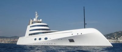
Giga Yacht "A"... One of the world's most beautiful yachts
This 387 foot, 150,000,000 Euro Yacht belongs to Russian Billionaire Andre Melnichenko. Apparently, fueling this behemoth costs around $1,400,000 alone (Doesn't make sense, must be an extra large tank

YACHT CHARTERS BY LUXURYRETREATS
Luxury Retreats is your source for the most luxurious and well appointed yacht charters in the world, guaranteed to make your sailing holiday an unforgettable experience.
Yacht or boat rentals are a unique way to explore some of the most beautiful and interesting places in the world. Relax in the luxurious surroundings of your floating palace while it gracefully transports you from port to exotic port. Revel in the romance of crimson sunsets at sea with your loved one or enjoy the company of all your friends as you lounge on the deck. When you rent a yacht, the journey is just as enchanting as the destinations.

An outstanding cruise vessel in Phuket, introduces you the world of turquoise Andaman Sea. With the modern standard and traditional design, Siam Junk will create an amazing luxury trip to exceed your expectations.


The 73 ft Predator 72 Splash (shown below), will be on offer in Cannes, current asking price $2.3M. In view of declining yacht prices, the vendor should be very flexible.
The Sydney Hobart Yacht Race

Maltese Falcon Designer's 1920s-Style Superyacht Inspired by JFK
Ken Freivokh, designer of the famed Maltese Falcon, the world's largest, most high-tech, beautiful and costliest sailing yacht, has gone classic for his latest project, the 1920's-inspired superyacht Sycara IV (above). The 151-ft. luxury yacht, built by the Burger Boat Company in Wisconsin, is designed to cruise the Great Lakes in high style and is partly inspired by John F. Kennedy's yacht the Honey Fitz. The aluminum-bodied craft resembles a classic wooden motor yacht with a schooner bow and fantail hull. The Art Deco-inspired interior woodwork is a masterpiece of handcrafted mahogany and madrone burl, with ebony, sycamore and padouk accents highlighted with stainless steel details in scores of inlays and moldings. Lalique bathroom fixtures are the finishing Deco touch. Of course she's also equipped with every bit of state-of-the-art tech you'd expect in a modern superyacht

every tow years the Rolex Swan Cup transform the water off the coast of Sardina into a sea of competitive racing.


Giga Yacht "A"... One of the world's most beautiful yachts
This 387 foot, 150,000,000 Euro Yacht belongs to Russian Billionaire Andre Melnichenko. Apparently, fueling this behemoth costs around $1,400,000 alone (Doesn't make sense, must be an extra large tank


YACHT CHARTERS BY LUXURYRETREATS
Luxury Retreats is your source for the most luxurious and well appointed yacht charters in the world, guaranteed to make your sailing holiday an unforgettable experience.
Yacht or boat rentals are a unique way to explore some of the most beautiful and interesting places in the world. Relax in the luxurious surroundings of your floating palace while it gracefully transports you from port to exotic port. Revel in the romance of crimson sunsets at sea with your loved one or enjoy the company of all your friends as you lounge on the deck. When you rent a yacht, the journey is just as enchanting as the destinations.
An outstanding cruise vessel in Phuket, introduces you the world of turquoise Andaman Sea. With the modern standard and traditional design, Siam Junk will create an amazing luxury trip to exceed your expectations.


The 73 ft Predator 72 Splash (shown below), will be on offer in Cannes, current asking price $2.3M. In view of declining yacht prices, the vendor should be very flexible.
The Sydney Hobart Yacht Race

Maltese Falcon Designer's 1920s-Style Superyacht Inspired by JFK
Ken Freivokh, designer of the famed Maltese Falcon, the world's largest, most high-tech, beautiful and costliest sailing yacht, has gone classic for his latest project, the 1920's-inspired superyacht Sycara IV (above). The 151-ft. luxury yacht, built by the Burger Boat Company in Wisconsin, is designed to cruise the Great Lakes in high style and is partly inspired by John F. Kennedy's yacht the Honey Fitz. The aluminum-bodied craft resembles a classic wooden motor yacht with a schooner bow and fantail hull. The Art Deco-inspired interior woodwork is a masterpiece of handcrafted mahogany and madrone burl, with ebony, sycamore and padouk accents highlighted with stainless steel details in scores of inlays and moldings. Lalique bathroom fixtures are the finishing Deco touch. Of course she's also equipped with every bit of state-of-the-art tech you'd expect in a modern superyacht

every tow years the Rolex Swan Cup transform the water off the coast of Sardina into a sea of competitive racing.

CHAPTER FIFTEEN -- SHADOWS
(With thanks to The Pastel Journal where this was originally published.)

Light is the life of a painting, but shadows define the light. Leonardo da Vinci wrote, “Shadows are the manifestation by bodies of their forms. The form of bodies would not show their particulars without shadow.” If we think of “bodies” as objects in the world, Leonardo’s statement is clearer: Objects cast shadows, which show form.
Without light there is no shadow, so the source of the light and its direction become key. The sun casts soft shadows down a wall, showing the path of the branch and leaves overhead, as well as the uneven shape of the wall. Some parts of the shadow are sharply etched; others are silky soft, the degree of detail dependant on the distance the shadow travels.
Value is perhaps one of the most important considerations in painting shadows, requiring the artist to carefully choose just how dark or light a particular shadow is.
The color of a shadow often almost defies description. Gray is too simple to depict a complex blend of colors and will not do justice to shadows.
Because pastels are a semi-transparent medium they lend themselves to the subtle transparency of shadows. Whether put down in soft layers or gently blended, pastels make beautiful shadows.
In landscape painting the source of light is clearly the sun, warm and yellow, casting shadows across the land and other planes. Because we have only one sun, shadows are cast in only one direction. However, sunlight may be direct or reflected, which can account for the mystery of shadows. Reflected light can add delightful complications, causing variations in angles and colors. Look for the mingling of sharp, crisp shadows created by closer objects and the fat, rounded shadows from those farther away.
Indoors, warm or cool lights cast shadows of varying depth and color and, when combined with available daylight from windows, may cast shadows in different directions.
“In the shadows the mysteries dwell,” da Vinci is said to have remarked. Master of chiaroscuro, he used deep, dark shadows to focus the eye on areas of clear light, creating depth and mood in his paintings. He did not neglect the mid-tone shadows, however, understanding that “shadows can be infinitely obscure or display an infinity of nuances in the light tones."
To paint the fine distinctions that can be found in shadows you must first select their proper values. Look for the nuances da Vinci mentions, the variety of shadows from the deepest crevice to the most insubstantial whisper of shade from a distant cloud.
 Gaze into the light area and analyze a shadow’s value using your peripheral vision to perceive correctly the proper tone of even the most delicate shadow. When you stare into shade your pupils dilate and your eyes adjust to the dimness so that over time you can almost see in the dark.
Make use of your peripheral vision even when using a photograph, to aid you in seeing values more accurately, but be aware that the photograph is at best inaccurate. If you rely on photographs to decide the value of the shadow you can easily be led astray. The camera is a far less sensitive instrument than the human eye and averages the available light, resulting in overly dark shadows.
Take time to look at shadows, recording their values in your mind’s eye, rather than copying a photo. That way, when you use a photograph you will remain independent of it and remember the relative transparency of shadows.
All shadows are transparent, except when no light is present in them at all. Most shadows allow the viewer to see details and colors within them, though not to the same degree as in the light plane. If they were not transparent our world would be reduced to pure black and white, all light or all shade. Instead there are degrees of shadows and only some are inky black.
Twilight Crossroads, 8" x 17"
 When painted correctly, a shadow does not look like something that has been laid over an object. It becomes an integral part of the object. If the shadow looks like a sock draped over the wall it needs to be more transparent. Only in the deepest darkness are shadows so thoroughly black as to become opaque, and those are usually found in outside at night or in a very dark room.
The value of a shadow becomes progressively lighter as it travels away from the object casting it. Shadows are darker where they originate and lighter where they end, due to the addition of light reflected from the sky or ambient light in a room.
As a broad generalization, the shadow side of an object is somewhat darker than the shadow it casts, due to this addition of light in the horizontal plane. However, this can be affected by the local color of the object, so that a white wall will not be as dark as the shadow it casts on green grass.
Shadows are all around you. Take a moment and look at a cast shadow, noticing how it becomes slightly lighter as it moves away from the thing that is casting it. The deepest shade is where the shadow begins.
Shadows are subject to the laws of aerial perspective, and so become lighter in value and cooler in color with distance. The shadow of a cloud cast at your feet is darker than the shadow of the cloud on distant mountains. Likewise the shadow in the near foreground of a still life is a degree darker than the one farther back in the composition, though this may be almost imperceptible. Still, as the artist attempts to capture the air between near and far objects, the degree of difference in a shadow’s value may become key.
The broad penumbra of a shadow may allow deeper shadows within. For instance, think of the concentrated shadows beneath a clump of grass in the shade of a tree or the still life where dense shadows are tucked in the recesses of a folded cloth in shade.
“Shadows should always partake of the color of the bodies they conceal," da Vinci elaborated for us. Shadow colors depend on the objects that cast them and that they are cast upon.
 To keep your shadows colorful but believable try this recipe: Imagine the local color of the object upon which the shadow is cast, slightly darkened by the shadow and somewhat blued by the sky if outside, or by the color of the light source inside.
This recipe will work for you as you begin to paint shadows, but as with any recipe, you should flavor it so that it becomes your own. A good cook knows that the recipe is a great starting point, but it needs the personal zest or subtle variations of the chef to make it special. Do not slavishly adhere to it; add a few dashes of colors of the correct value to spice up your shadows.
Oftentimes what color to use to begin can be a difficult decision. What color is that wall or the sidewalk in shade? It might help you to settle on the color of the object in sunlight before trying to determine the color of the shadow. If the wall is pink, darken it slightly; add a little blue and you get lavender. If the wall is yellow, darken it and add blue for green. White? Darker and bluer becomes light blue. You get the idea.
Remember, however, that a yellow wall does not become a green wall just because it is in shadow. You must always be sure to add a bit of the local color, in this case yellow, into the shadow area, selecting the proper value.
If you are still having trouble choosing a starting point, try standing back from the subject and simply naming one color. Walk away from the shade or a few steps off from your photograph. Name a color on the color wheel. Purple? Green? Remember that gray is not on the color wheel, nor is brown.
With distance you won’t see as many of the nuances of color and will be better able to name one simple color to use. Once you name it, run to your easel and find that color and begin there. Start with a color, then flavor it to make nuances of gray or brown, if necessary, or retain the freshness of whatever color you choose, as long as it is the correct value.
When painting interiors, the color of the light source can greatly influence the color of cast shadows. A yellow or pink spotlight casts a warm glow on the object, often resulting in warm shadow colors. Conversely, the overall luminescence of fluorescent light casts a cool light and soft, cool shadows. Neon light casts a bright glare, but generally has little power to cast shadows, leaving only a soft pool of shadow glowing with the neon color.
The strongest color is often found in the half-light areas of a painting. Where the object is flooded with light the color is bleached out, while in the dark shadows color is lost, leaving the transition areas of half-light to half-dark colorful and descriptive. These can be the most beautiful portions of your painting, telling your viewer more about the color of light and shadow than they realize.
Some people see the color of a shadow as complementary to the color of the plane on which it is cast, an idea made popular by the Impressionists. Of course, if you stare for a long time at any color you will begin to see its complement as an afterimage. This can work beautifully, but need not be a hard and fast rule. Be adventurous and try different combinations of colors to see how they work.
Closely examine the edges of shadows. Sometimes you will see a slightly warm quality there due to the afterimage, which leaves a halo of complementary color along the edge. This might suggest some great color ideas to you as an artist and result in exciting shadow colors.
Sidewalk Shadows, 12x18”
 At their simplest, shadows on the ground could be described as basically cool in color because the cool blue of the sky is injected into them. Shadows on any vertical plane, such as the wall, are often somewhat warmer in color because light reflecting from the ground may bounce into them.
The idea of a recipe, therefore, is only a suggestion to help you begin. Shadows are complex and varied, and the colors used are creative decisions that every artist may choose.
Remember that shadows have no independent shapes of their own. They show the shape of the object that casts them and the shape of the object upon which they are cast. If a shadow changes direction or shape, either the ground it is crossing is causing it or it comes from the object casting it from above. It changes for a reason.
Shadows are crisp and detaildd at the root and softer at the end. The farther a cast shadow travels the softer and rounder its shape becomes. The reason for this is the round shape of our sun.
This may be easier to understand if you think about sunspots, where light peeks between the leaves of a tree and is cast onto the ground. These spots will be rounder in shape the farther the sun travels before it hits the ground. The shapes of the leaves will be more apparent the closer they are to the wall. The sunspots will, conversely, appear rounded if the leaves are far away from the wall. This is because the gap where the sun shines through forms a kind of atmospheric lens that focuses the light in the shape of the sun, which is what accounts for the rounding of shadows with distance.
In fact, if you examine shadows and sunspots during an eclipse of the sun, the shapes change to mimic the sun’s shape. The next time there is an eclipse, rather than looking at the sun, pay attention to the shadows cast on the ground. It is remarkable to find crescent-shaped spots and shadows there.
Different media lend themselves nicely to different subjects. Because pastels are semi-transparent they may be lightly layered over one another to create the perfect shadow effect. You can apply a slightly darker, cooler value on your first pass to establish the location of the shadows, then lay several delicate layers of varying colors over that, adjusting to the correct value. Be sure to stroke in a fresh, light touch of the local color, such as the color of the wall.
If you resist the urge to blend, your colors will sparkle with the glow only pastels can give, though some light blending can result in soft transitions of color.
Spend time observing shadows. Look at the shadows on this page, your hands, the table behind it. Shadows are everywhere, defining the light, showing the forms of things.


Pyracantha, 18" x 12"
Light is the life of a painting, but shadows define the light. Leonardo da Vinci wrote, “Shadows are the manifestation by bodies of their forms. The form of bodies would not show their particulars without shadow.” If we think of “bodies” as objects in the world, Leonardo’s statement is clearer: Objects cast shadows, which show form.
Without light there is no shadow, so the source of the light and its direction become key. The sun casts soft shadows down a wall, showing the path of the branch and leaves overhead, as well as the uneven shape of the wall. Some parts of the shadow are sharply etched; others are silky soft, the degree of detail dependant on the distance the shadow travels.
Value is perhaps one of the most important considerations in painting shadows, requiring the artist to carefully choose just how dark or light a particular shadow is.
The color of a shadow often almost defies description. Gray is too simple to depict a complex blend of colors and will not do justice to shadows.
Because pastels are a semi-transparent medium they lend themselves to the subtle transparency of shadows. Whether put down in soft layers or gently blended, pastels make beautiful shadows.
In landscape painting the source of light is clearly the sun, warm and yellow, casting shadows across the land and other planes. Because we have only one sun, shadows are cast in only one direction. However, sunlight may be direct or reflected, which can account for the mystery of shadows. Reflected light can add delightful complications, causing variations in angles and colors. Look for the mingling of sharp, crisp shadows created by closer objects and the fat, rounded shadows from those farther away.
Indoors, warm or cool lights cast shadows of varying depth and color and, when combined with available daylight from windows, may cast shadows in different directions.
“In the shadows the mysteries dwell,” da Vinci is said to have remarked. Master of chiaroscuro, he used deep, dark shadows to focus the eye on areas of clear light, creating depth and mood in his paintings. He did not neglect the mid-tone shadows, however, understanding that “shadows can be infinitely obscure or display an infinity of nuances in the light tones."
To paint the fine distinctions that can be found in shadows you must first select their proper values. Look for the nuances da Vinci mentions, the variety of shadows from the deepest crevice to the most insubstantial whisper of shade from a distant cloud.
Sun Streaks, 8" x 17"

Make use of your peripheral vision even when using a photograph, to aid you in seeing values more accurately, but be aware that the photograph is at best inaccurate. If you rely on photographs to decide the value of the shadow you can easily be led astray. The camera is a far less sensitive instrument than the human eye and averages the available light, resulting in overly dark shadows.
Take time to look at shadows, recording their values in your mind’s eye, rather than copying a photo. That way, when you use a photograph you will remain independent of it and remember the relative transparency of shadows.
All shadows are transparent, except when no light is present in them at all. Most shadows allow the viewer to see details and colors within them, though not to the same degree as in the light plane. If they were not transparent our world would be reduced to pure black and white, all light or all shade. Instead there are degrees of shadows and only some are inky black.
Twilight Crossroads, 8" x 17"

The value of a shadow becomes progressively lighter as it travels away from the object casting it. Shadows are darker where they originate and lighter where they end, due to the addition of light reflected from the sky or ambient light in a room.
As a broad generalization, the shadow side of an object is somewhat darker than the shadow it casts, due to this addition of light in the horizontal plane. However, this can be affected by the local color of the object, so that a white wall will not be as dark as the shadow it casts on green grass.
Shadows are all around you. Take a moment and look at a cast shadow, noticing how it becomes slightly lighter as it moves away from the thing that is casting it. The deepest shade is where the shadow begins.
Shadows are subject to the laws of aerial perspective, and so become lighter in value and cooler in color with distance. The shadow of a cloud cast at your feet is darker than the shadow of the cloud on distant mountains. Likewise the shadow in the near foreground of a still life is a degree darker than the one farther back in the composition, though this may be almost imperceptible. Still, as the artist attempts to capture the air between near and far objects, the degree of difference in a shadow’s value may become key.
The broad penumbra of a shadow may allow deeper shadows within. For instance, think of the concentrated shadows beneath a clump of grass in the shade of a tree or the still life where dense shadows are tucked in the recesses of a folded cloth in shade.
“Shadows should always partake of the color of the bodies they conceal," da Vinci elaborated for us. Shadow colors depend on the objects that cast them and that they are cast upon.
Evening Complements, 11" x 11"

This recipe will work for you as you begin to paint shadows, but as with any recipe, you should flavor it so that it becomes your own. A good cook knows that the recipe is a great starting point, but it needs the personal zest or subtle variations of the chef to make it special. Do not slavishly adhere to it; add a few dashes of colors of the correct value to spice up your shadows.
Oftentimes what color to use to begin can be a difficult decision. What color is that wall or the sidewalk in shade? It might help you to settle on the color of the object in sunlight before trying to determine the color of the shadow. If the wall is pink, darken it slightly; add a little blue and you get lavender. If the wall is yellow, darken it and add blue for green. White? Darker and bluer becomes light blue. You get the idea.
Remember, however, that a yellow wall does not become a green wall just because it is in shadow. You must always be sure to add a bit of the local color, in this case yellow, into the shadow area, selecting the proper value.
If you are still having trouble choosing a starting point, try standing back from the subject and simply naming one color. Walk away from the shade or a few steps off from your photograph. Name a color on the color wheel. Purple? Green? Remember that gray is not on the color wheel, nor is brown.
With distance you won’t see as many of the nuances of color and will be better able to name one simple color to use. Once you name it, run to your easel and find that color and begin there. Start with a color, then flavor it to make nuances of gray or brown, if necessary, or retain the freshness of whatever color you choose, as long as it is the correct value.
When painting interiors, the color of the light source can greatly influence the color of cast shadows. A yellow or pink spotlight casts a warm glow on the object, often resulting in warm shadow colors. Conversely, the overall luminescence of fluorescent light casts a cool light and soft, cool shadows. Neon light casts a bright glare, but generally has little power to cast shadows, leaving only a soft pool of shadow glowing with the neon color.
The strongest color is often found in the half-light areas of a painting. Where the object is flooded with light the color is bleached out, while in the dark shadows color is lost, leaving the transition areas of half-light to half-dark colorful and descriptive. These can be the most beautiful portions of your painting, telling your viewer more about the color of light and shadow than they realize.
Some people see the color of a shadow as complementary to the color of the plane on which it is cast, an idea made popular by the Impressionists. Of course, if you stare for a long time at any color you will begin to see its complement as an afterimage. This can work beautifully, but need not be a hard and fast rule. Be adventurous and try different combinations of colors to see how they work.
Closely examine the edges of shadows. Sometimes you will see a slightly warm quality there due to the afterimage, which leaves a halo of complementary color along the edge. This might suggest some great color ideas to you as an artist and result in exciting shadow colors.
Sidewalk Shadows, 12x18”

The idea of a recipe, therefore, is only a suggestion to help you begin. Shadows are complex and varied, and the colors used are creative decisions that every artist may choose.
Remember that shadows have no independent shapes of their own. They show the shape of the object that casts them and the shape of the object upon which they are cast. If a shadow changes direction or shape, either the ground it is crossing is causing it or it comes from the object casting it from above. It changes for a reason.
Shadows are crisp and detaildd at the root and softer at the end. The farther a cast shadow travels the softer and rounder its shape becomes. The reason for this is the round shape of our sun.
This may be easier to understand if you think about sunspots, where light peeks between the leaves of a tree and is cast onto the ground. These spots will be rounder in shape the farther the sun travels before it hits the ground. The shapes of the leaves will be more apparent the closer they are to the wall. The sunspots will, conversely, appear rounded if the leaves are far away from the wall. This is because the gap where the sun shines through forms a kind of atmospheric lens that focuses the light in the shape of the sun, which is what accounts for the rounding of shadows with distance.
In fact, if you examine shadows and sunspots during an eclipse of the sun, the shapes change to mimic the sun’s shape. The next time there is an eclipse, rather than looking at the sun, pay attention to the shadows cast on the ground. It is remarkable to find crescent-shaped spots and shadows there.
Different media lend themselves nicely to different subjects. Because pastels are semi-transparent they may be lightly layered over one another to create the perfect shadow effect. You can apply a slightly darker, cooler value on your first pass to establish the location of the shadows, then lay several delicate layers of varying colors over that, adjusting to the correct value. Be sure to stroke in a fresh, light touch of the local color, such as the color of the wall.
If you resist the urge to blend, your colors will sparkle with the glow only pastels can give, though some light blending can result in soft transitions of color.
Spend time observing shadows. Look at the shadows on this page, your hands, the table behind it. Shadows are everywhere, defining the light, showing the forms of things.

Field Shadows, 9" x 12"
Soccer World Cup Football Players Photos
List of famous soccer players. Photos Wallpapers Pele, Maradona, Ronaldinho, Beckham, Cristiano Ronaldo and many more.Soccer pictures of the most famous soccer players in the world. Ronaldinho, Ronaldo, Edgar Davids, Batistuta, Luis Figo, Cristiano Ronaldo, Raul.soccer player stock photos soccer player stock images photos famous soccer players pictures pele soccer player kaka soccer player pictures female soccer players best soccer players pictures funny pictures soccer players.

Links to this Picture (Html Codes) (Copy/Paste into your own Website or Blog):

Links to this Picture (Html Codes) (Copy/Paste into your own Website or Blog):

Links to this Picture (Html Codes) (Copy/Paste into your own Website or Blog):

Links to this Picture (Html Codes) (Copy/Paste into your own Website or Blog):

Links to this Picture (Html Codes) (Copy/Paste into your own Website or Blog):

Links to this Picture (Html Codes) (Copy/Paste into your own Website or Blog):

Links to this Picture (Html Codes) (Copy/Paste into your own Website or Blog):

Links to this Picture (Html Codes) (Copy/Paste into your own Website or Blog):

Links to this Picture (Html Codes) (Copy/Paste into your own Website or Blog):

Links to this Picture (Html Codes) (Copy/Paste into your own Website or Blog):

Links to this Picture (Html Codes) (Copy/Paste into your own Website or Blog):
Subscribe to:
Comments (Atom)