CHAPTER EIGHT– CLOUDS

What could be more beautiful than the elegance of delicate clouds decorating the soaring blue sky? However, too often clouds become a muddy mess or heavy, leaden blobs. Here are a few suggestions to help you find the structure of clouds and keep them light and airy, clean and bright.

CLOUD BOX
Many people look at clouds and become baffled at the complexity they see there. Think of a cloud as a box, having a top, bottom, and sides. I know this seems far-fetched, since a box appears to contrast sharply with the loose, unstructured nature of most clouds, but if you will begin with the idea that clouds have a structure such as a box it will go a long way in helping you configure clouds properly in many instances. This simple look at the underlying structure should begin to help you see that even the wispiest cloud has three-dimensional form.
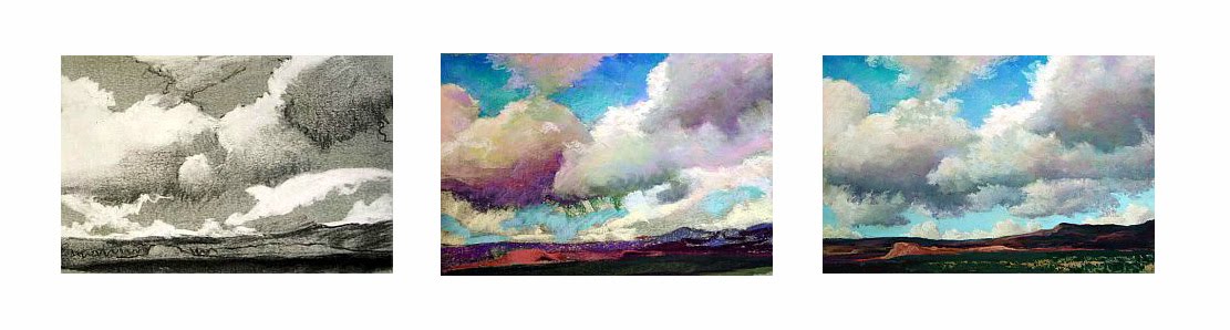
Coronado Sky, 9x12"

Think of a glass plate the size of the sky, stretching overhead to the horizon. Mentally place your cloud boxes on this sheet of glass, looking upward through the glass plate. Think about how the clouds grow smaller near the horizon, overlapped by the larger, nearer clouds that float higher in the sky overhead. You see far more of the bottoms of the nearby, overhead clouds than you do of the clouds farther away that are much lower in the sky. Thus, painting the shadowed bottoms of clouds will identify their height in the sky.

COMPOSING
Have you ever noticed that clouds are never still? If not, try painting on location and you’ll soon observe their ever-changing habit. The wind blows persistently from one direction. You’ll get far more believable results when you compose clouds with this motion in mind. If you’re painting from a photograph, identify the “point of wind”, the direction from which the wind is coming. You’ll often have visual clues such as crested cloud tops, ragged flags of clouds trailing behind or swelling cloud tops showing strong updrafts. Keep this directional thrust in mind as you do a completed underdrawing of the clouds.

Because so often clouds seem amorphous and vague an underdrawing to plan shapes, planes and values is very important. Many times students become baffled at the complexity and seeming indistinction of clouds and fail to plan these elements. You simply cannot abandon the clouds to a formless set of loosely sketched lines. Instead spend time analyzing where the clouds are blowing, how they overlap, and what tones best will describe what you see.
Scent of Rain, 18x24"

VALUE
Clouds are among the lightest values in the landscape. They’re light in color and they float in the lightest plane of the painting, the sky. Remember that even the dark bases of the clouds in shadow are among the lighter values in the painting. Dark clouds are never darker than the earth values because they block the light, casting shadows that cause the earth to be darker. An overly dark cloud becomes the proverbial “lead balloon”! Think of it this way: clouds are made of water droplets and ice, through which light filters to one degree or another. No self-respecting cloud could possibly be as dark as the shadowed rock of a mountain. So keep the clouds light, even in the darkest of instances.

Don’t trust photographs for evidence of this. Often a photo will give the illusion that dark storm clouds are as dark or darker than the land plane, but further examination usually proves that it’s the fault of the camera’s habit of averaging the light. Your own observations will be far more accurate and valuable, so the next time a cloudy sky threatens, spend some time outdoors analyzing the values you see. Squint one eye and close the other and ask yourself where the darkest dark resides, and just see if it isn’t in the land plane. Remember, too, that we are not in the business of painting the exceptions we see, but applying those generalities we observe regularly.

Clouds have a special glow to them because they hold light inside. The water or ice they’re composed of tends to bounce radiance around inside, creating a delightful scattering of light. Carefully retain the light in the center of the cloud to create this special glow, rather than giving clouds only a stark white edge. This silver lining effect is only found when the cloud is directly intervening between your eye and the sun. Instead, pull light from the center of the cloud outward to the edges, while using light and shaded areas to describe thicker or thinner areas, to some degree or another.

The edge of a cloud in a clear blue sky can be etched with brilliant clarity or can be slightly grayed where cloud banks overlap. Small cloud fragments, broken off from a cloud mass and silhouetted against the sky, are often slightly darker in value and cooler in color because the sky shows through them.

Twenty minute cloud studies done on various colors, Canson paper

COLORS
What color is a cloud? White is a childishly simple description, since clouds are virtually all colors. Generally, a cloud is warm on top, because of the warm color of the sun, and cool on the bottom, which is in shadow. Don’t limit yourself to white, gray and blue, but paint clouds using a wide palette of light and medium-light colors. They will look far more realistic than mere gray accomplishes.

Remember that the Law of Diminishing Intensity (per Carlson) states that the atmosphere cools and lightens all colors but slightly darkens and dulls whites and near-whites. Clouds, which are rarely ever pure white, appear rosy-white or yellowish-white on the horizon, perhaps due in part to pollution. Paintings from the 1800s and earlier show little evidence of such yellowing, appearing to be more pale, pale rose. Clouds at the zenith of the sky can contain brilliant white, especially in contrast to the deep blue of the sky.

SIMPLE MISTAKE
Why do most beginner’s paint clouds too chalky-white? The answer lies in a simple mistake that we make when we tilt our heads upwards to look at the sky overhead. As we look straight up we see the very darkest and most brilliant blue of the sky, and the very whitest clouds. We might assume that this high contrast of deep blue and blinding white is the norm and paint clouds and sky that way, as children often do. But how often do we paint the sky directly overhead? Instead, to determine the value of your clouds, look off toward the horizon. Compare the value of the sky and clouds, noticing that as the sky lightens on its journey toward the horizon the clouds progressively darken, dulling slightly, until the values nearly need. This beginning one-third arc of the sky, after all, is most often the part we include in our paintings, not the sky immediately above us.


GRAY CLOUDS
What is it about gray skies that can make the landscape so intensely beautiful? I was recently driving along a highway on a cloudy morning when I saw the light on some nearby trees. The colors of the highway itself, along with the glowing trunks and foliage, were breathtakingly intense. I thought it odd that an everyday piece of pavement, the ordinary tree trunks and usual green foliage looked so powerful. Then I realized that part of the reason was the dominant neutral of the gray behind it all. The clouds had added moisture to the atmosphere, which also seemed to intensify the colors, making them seem somewhat more saturated, but it was that gorgeous gray that really caught my eye.

Gray is one of those mysterious, almost unexplainable colors. Most pastelists tend to grab for the color on their wide-ranging palette that they need, and we certainly have grays. Pastel sets usually come with a standard warm and cool gray, but these ‘out of the tube’ colors seem static. There are occasional grays made by various manufacturers that are interesting, but I’ve found that making my own grays provides ones that are far livelier. This requires a little more advance planning, but it’s worth the time and effort to achieve a glowing gray.

Technically gray is arrived at by mixing two complementary colors. You’ll often hear about graying a color by layering the opposite color of the same value on top, which is an effective tool. However, this graying affect of one color laid atop another is different than mixing up colors to arrive at a gray. When I lay down only two colors and try to mix a gray—colors that are opposite on the color wheel—they usually become rather drab and boring, if they end up gray at all. It takes a trained eye and a very even hand to find and use the exact opposite colors, as well as the exact same value, and exactly equal amounts of each color. This combination becomes more a dulled color than a true gray, so I’ve derived a means of creating a mixture of colors that makes a lot more interesting grays.

Let’s say you want to paint the deep, intense gray clouds I saw behind the grove of trees. You have to start somewhere and I’ve discovered that often this need to choose one color to begin with can be confounding. You simply have to ask yourself if you had to choose one color, a color that you’d find on a simple primary-secondary color wheel, what would you choose? Ask yourself if it is warm or cool, which helps you get closer to the area on the color wheel. If warm, is it more orange, red, or yellow? If cool, is it more purple, blue or green? This will be your target color.

Next you want to identify the value of your gray. How dark or light is it? You have to identify the value in relationship to all the other values around it, of course, which is why doing a charcoal underdrawing will help you. Once you have completed your value drawing you can simply hold a value finder card over the area of the gray to identify how dark it is. Then you can find your target color in the correct value. Did you decide on purple? Make some marks a piece of paper until you find a purple of that value. If it’s blue or red or green or yellow or any color doesn’t matter. Find the right value.

Once you have your target color in the proper value, you need to find two other colors of the same, or very close to the same, value. I suggest you will find layering three colors to be far more effective than using only two. You usually need to establish enough depth in the pastel on your paper to make it paintlike, which requires at least three passes with your colors, perhaps more. To that end, using your target color, locate the triad of colors on the color wheel. This means that if you have, say, a purple of the right value, you want to find an orange and a green in the same value (secondary triad). These three colors make a triangle on the color wheel. Maybe you used a red as your target color. If so, your triad, or triangle of colors, will be red, blue and yellow (primary triad). What matters is that the values remain very closely the same. One problem is that yellow just doesn’t darken very well, and the nature of cloudy skies is that they tend to be darker in value. Dark yellow tends to go towards a very ugly greenish-yellow hue, or into browns that become reddish, which makes the resulting gray rather sickly looking. As a result, I tend far more often to use the secondary triad of orange, purple and green to make animated and appealing grays.

Don’t necessarily start with your target color, but head that direction by layering the other colors in place first. For instance, place the orange and green and then the purple, heading gently toward your target color. You’ll most likely have to mix these colors using multiple layers, allowing the sticks to become almost like a stiff brush as the edge begins to blend colors into one grayish purple. You’ll find with practice that the final color layered in place, in this case the purple, is the one that determines the flavor of what you see. You can do this mixture with any color, of course, not just the primary and secondary colors, and with some practice you’ll begin to have a sense of which three colors will make the gray you’re heading for. You can also do this in any value you need, whether light pale gray, medium gray, dark moody gray or any value in between.

Why does the secondary triad work so well? I think it’s because the three colors you use end up combining all the colors from the primaries and secondaries. You end up using an entire rainbow of color, all in the same value, making your grays dynamic. Instead of flat, boring out-of-the-tube neutrals you have every color dancing together in a neutral, which in turn allows any other color used nearby to harmonize with the lively gray. This is a good part of the reason why the grimy pavement of the highway, the ordinary trunks and the plain foliage all looked quite stunning, I believe. No matter what color they were the gray contained it, allowing a marriage that highlighted each color.


PAINT A BLENDED SKY
To paint a vital and attractive sky, try finger-blending your pastels to soften colors and edges, yet keep the clouds clean and bold. While blending pastels has a reputation for making muddy colors, you can layer and blend several times and then recover the sparkling quality of pastels. This technique works well on fine, deep-grained sanded surfaces or soft, absorptive paper. Some of the deeper sandpapers can abrade fingertips, although when used carefully they render beautiful results.


Since the sky is generally the lightest value in a landscape, keep your paper tone light or medium. This will help you structure your values correctly and will keep the colors glowing. If your tone is dark you have to work too hard to blend over it, which wastes precious pastels.

Start with an underdrawing in extra soft thin vine charcoal, adding mediums and highlights with a pastel pencil. It’s fine to compose from a photograph, but don’t try to recreate it. Carefully sketch in all of the values and details as you correct compositional problems and make decisions about contrast and values. This drawing will lie beneath your painting and will be blended into your colors, so be sure that you’re happy with it before going on to the next step.

Begin your painting with the very darkest colors, which may only be medium-light in value because the tone of the sky is so light. Don’t blend yet. Lightly lay in the medium and then the light colors. Within any one area be sure to put down two or three colors of the same or similar values to keep colors lively. Remember that colors of like values will seem to melt together, lying in the same plane of the picture. When you reach the light colors, don’t use white to begin. Save the lightest lights, whether white or any other color, for the very last touches on the painting, several layers later.

To create lively and beautiful grays use complementary or tertiary colors over one another. A light layer of lavender, peach and green, in any order, will result in a subtle hue if the colors you select are close in value, as will using yellow, pink and blue. Layering green over pink, blue over orange or lavender over yellow can make lovely grayed colors. Rather than reaching for the gray pastels in your palette, begin with these color suggestions and once you’re happy with the grays you’ve mixed, layer the box grays over the top only if needed. Make two or three passes so that you have at least three layers of color all over the paper. Keep these layers loose, but be sure that you have enough pigment covering the paper to blend without revealing too much of the ground. Don’t add any details.

Now comes the magic: With your fingers or the heel of your hand, lightly blend all the pastel together. Be loose and free, moving your whole arm. If you’ve been careful to use colors of the same or similar values, the blended colors are rich and beautiful, not at all muddy. Stand back or squint to see how your sky begins to take shape on the paper.

If you see areas that need changing, use a foam house painting brush (the kind found at home stores, used to paint trim) to wipe out selected parts. Then simply re-establish your colors and blend again. The delightful part is that in places where values change you can lose the edges, achieving soft transitions along the edges and making the cloud shapes quite believable. After blending, remain open to the possibility that a somewhat muddy color might become a subtly beautiful shade if you add another layer over it and blend it in place. Don’t give up too easily!

For your second pass over the paper, begin to work back over the sky with a fresh layer of the same colors, starting with the darks (which will most likely be medium values) and working through to the lights again, correcting color if needed or adding new ones to give your sky some zing. Blend this layer just as you did the first. You can add many layers of blended color, but be careful not to overfill the grain of the paper. You’ll know you’ve gone too far if you find “dead” spots in the paper where it won’t accept any more pastel. If this happens you can wipe out with the foam brush, as described above, or use a small mask spray to place a fine layer of fixative in the immediate area and lightly work over that when it’s dry. As your skill in blending grows, you’ll learn to stop before overfilling the grain.

In the final layer, create details with the same palette of colors you used in the underpainting. Now is the time to catch the elegant edge of a translucent cloud or delicate trailing wisps of ragged gray clouds. If you’ve been wise and saved the white for last, you can create brilliance with touches of it in the appropriate areas. Your goal is to use less and less blending as you layer in details so that you actually create a three-dimensional quality in your sky and clouds, and recapture the sparkling glow of unblended pastels.

One word of warning: Blending on deep sandpaper causes sore fingertips that can even begin to bleed. If you’re new to this technique, take it easy at first. Over time you’ll know just when to stop, but in the beginning you can blend too much and not realize how much it will hurt. If your fingers are too sensitive, try blending with a Sofft sponge, plastic eraser, tissue paper, paper towel or wear a surgical glove or finger cot. Each of these will give different effects that you might like, but in my opinion nothing works better than your fingers. It’s also a good idea to wear a barrier cream to keep from absorbing anything harmful through your skin. When applying it, remember to scratch your fingernails lightly over your palm to be sure the cream is under your fingernails.

With a little practice you’ll be able to layer and blend pastel to create wonderfully soft clouds. This finger-blending technique is an easy way to catch the drama and beauty of the clouds and sky.

Soft Morning, 8.75 x 13.5" on buttercup yellow Pastelmat

the lovely bones


just watched THE LOVELY BONES. i dont recommend the book to the kids. just watch the movie. und oh, i saw a movie poster with RYAN GOSLING as the salmon father. but in the movie, it was MARK WHALBERG. but still RACHEL WEISZ as the mother. :]

CHAPTER SEVEN--THE SKY

The sky is the key to the landscape. It determines the quality and quantity of the light, the color unity and the value contrast of your painting. Most landscape painters begin with the sky for these reasons.
When painting the sky, remember that it’s the lightest value in the picture. Carefully analyze the value of the sky, perhaps using a red filter. It contains the sun -- the source of the light -- and clouds, which are light in value and color.
Desert Morning, 12 x 9"
Now analyze the color. Look at the quadrant of the sky containing the sun and compare the color there to the exact opposite quadrant. Notice that it's warmer in color and slightly lighter. Ask yourself what color the other two quadrants are, as well. The sky progresses from a warmer blue to a slightly cooler color, depending on the direction you're facing.


Depending on where you live, the value of the sky may be lighter or darker than you think. Our beautiful bright blue skies in New Mexico, or any high and dry climate area, can appear to be very dark, but you shouldn’t let your blue become a gloomy color. Keep it light and airy. Conversely, in more humid, lower climes the sky may appear to be quite light in color, but you shouldn’t over-lighten it too much. Make your skies colorful, controlling the value.


Summer Heat, 9x12"

Even when we know this, we sometimes need to be reminded of it: The blue of the sky is deepest at the zenith and lightens at the horizon. This knowledge can help to create the effect of the giant blue bowl of the sky looming overhead, darkest at its highest point. The atmosphere around our planet when seen from space proves to be a fragile layer no thicker than an eggshell, speaking proportionally. The darkness of the zenith of the sky is essentially the black void of space seen through a thin blue shell of air. As we rise higher in altitude, even less of this blue atmospheric layer colors the sky, so that you see more of the darkness of space through less of the air. In arid areas the atmosphere contains less water vapor, making for clear, bright skies. In humid parts of the world the increased water vapor, which is less transparent, causes the sky to be a milky, paler blue. At lower altitudes the sky is paler in color because there’s actually more air to look through before reaching the black of space. At higher altitudes the thinner air makes for brighter, intensely blue skies. Think of the difference between the panorama you see standing on the top of a peak in the desert southwest, where the air is thin and dry, and the view from a bluff above the ocean looking out to sea. Both may be dramatic and beautiful, but high dry air gives a longer view than does thick humid air.

When painting skies around my home I like to use a mixture of blue-violet and blue-green to create the color of the sky. I’ve observed that summer skies seem to lean toward turquoise while winter skies are more violet. However, I urge you to observe for yourself and analyze whether this is true. Such a benchmark may be helpful in choosing whether to layer blues that lean a bit more toward green or violet.

Last Snow, 9x12"
As strange as it seems, the sky will appear to be not so light on a bright sunny day. The reason is that the sunlight flooding onto it raises the value of the land plane. The difference between the land and sky values is less than when clouds add highly contrasting shadows. A gray-day sky is lighter in value than a clear-day sky because the clouds catch and hold the light, much as does milk glass, making it brilliant, almost glaring, compared to the clear glass effect of a cloudless day.

CHAPTER SIX -- MOUNTAINS

(Originally published in The Pastel Journal)

Massive mountains loom on the horizon, a pale purple-blue backdrop to the hills and fields before them. Although they’re still thirty miles away, the jagged peaks are vividly etched against the soft blue sky. Shadows flow across the slopes, defining the repeated folds, a ray of light picking out the blue-green of a distant hillside. Mountains define the western skyline, rising from the high plains to altitudes so high that the uppermost reaches can be decorated with snow year-round. These giants set the stage for the drama of the West.

Mountains can pose some unique challenges to the artist. Doing a complete study so that you come to better understand the unique aspects of these massive ranges allows you to resolve such issues as scale, form, value and detail. This can be done as a separate sketch or as an underdrawing.

Charcoal underdrawing
The issue of scale is often the toughest to sort out. The inexperienced artist sometimes decides that in order to show the massive mountains she should try to fill the entire picture plane with nothing else. Mountains crowd the scene, with very little sky or foreground, but become oddly dwarfed by the context, or the lack of context, of the painting. Instead of massive crags, these appear to be mere hills. This is in part because surrounding elements serve to show the grandeur of the peaks. In a framework of sky and foreground, relative scale becomes apparent. Without elements to compare to the mountains, the viewer has no grasp of their size and will often assume they’re far smaller. Including clouds above or trees and grass in front, or both, gives the viewer a comparison by which to grasp the scale.

It’s best to have a good understanding of the form of the mountains you’re painting. Form, of course, is the three-dimensionality of an item. It shows depth, as well as height and length, making a triangle into a pyramid. In the case of mountains, the ways that peaks and valleys interplay -- close and far, large and small -- as well as the light and shadow that indicate these factors, add to the form. As you lay out the composition you’ll usually begin to perceive these forms in greater detail.

It’s a good idea to think about how the mountains you’re painting were fashioned over time. In the West, tectonic forces have thrust up the mountains, and continue to do so as continental plates slowly converge and slide atop one another. This seismic shift, which creates some of the largest mountains in the world, often results in a softer slope on the side of the range where the plate has been lifted. These more gradual slopes are gentler and often covered with trees. On the opposite face of the range the edge of the plate is exposed as it has been thrust into the air, creating sheer, sharp outcrops and crumbling rock faces. This exposed edge may reveal striations in many rich and subtle hues of gold, orange, red and purple running along the course of the range. Look for those places where a particular kind and color of rock takes up farther along the chain, repeated at similar altitudes, though often angled downward from the axis of the break.

Mountains are subject to the erosion caused by wind and rain, which wears away softer types of rock, leaving harder rock exposed. The granite faces of Pike’s Peak in Colorado have outlasted surrounding rocks unable to withstand eons of erosion. Often granite can take on a particular pinkish color, giving a fiery glow to mountains such as the Sangre de Christo (Blood of Christ) range in New Mexico, named for the almost blood red color these peaks become at sunset.

Dry and Cool, 12” x 18”

Occasionally an area of the earth’s crust will be thrust up into a large dome shape but because the seismic forces are somewhat less severe the crust does not crack and split apart. This results in softer rolling ranges such as the Black Hills of South Dakota, which can include extremely colorful rock layers that remain at remarkably similar altitudes. Again, look for ridges of rock linking neighboring mountains with their stripes of color.

Sometimes as the huge blocks of the earth's crust are tilted upward or are completely turned over by tectonic shifts, they push up along a fracture line or fault, resulting in ranges such as the Sierra Nevada in California. These chains have piles of loose rock deposited at the base by the scraping motion of the movement that created them, and often have a rough, jagged line of peaks, such as those characteristic of the Grand Tetons in Wyoming, or other areas where spectacular rock outcroppings occur.

When you paint recognizable mountain ranges -- those that have identifiable shapes such as the bold geometry of Half Dome or the Tetons’ toothy skyline -- it’s best to include characteristic natural elements and indigenous vegetation in the foreground. In other words, don’t put a saguaro cactus into the high regions of the Tetons, no matter how much you need a vertical element.

Often when the artist begins a detailed underdrawing of the peaks and valleys found in a mountain range she finds that she cannot tell what lies in front or behind, whether the mountainside continues to descend or begins to rise in one particular place. Rather than becoming blocked by this, unable to go on with the drawing, she must take matters into her own hands and simply decide. Unless you’re painting an extremely detailed exploration of every peak, no one but mountain climbers will argue with you. However, when you’re painting an identifiable and familiar mountain chain, be sure to conform relatively closely to the specific shapes and spacing of the crests.

South View, Placitas, 18x24”

Due to the effects of aerial perspective, certain elements begin to change as mountains recede toward the horizon. First, and most noticeable, everything becomes cooler in color and lighter in value. The intensity of warm colors fades. Detail is slowly lost, edges soften and the contrast in value diminishes. In his book Carlson’s Guide to Landscape Painting, written in 1929, respected art instructor John Carlson explains that as one looks sideways through the progressively thickening atmosphere it’s as though there were curtains of air hanging at regular intervals, like veils through which you see. Another way to picture this is to think of one-square-mile blocks of slightly bluish air stacked sideways and upward, filling the distance. The farther away an object is, the more blocks you must look through and the paler and bluer things become, until the most distant range of giant mountains is reduced to a mere line that’s nearly sky blue. Leonardo da Vinci, the consummate eyewitness of physical effects, noted this bluing of objects with increased distance. In the 1500s he observed that if an object “is to be five times as distant, make it five times bluer.” His advice still applies today. The only exception to this visual rule is white. In the distance white becomes slightly dull and warm, a pale pink or yellow. Distant snow isn’t the same bright white as that in the foreground. Clouds atop far peaks are somewhat yellowed by distance, enhanced by pollution. The values of all colors become paler in the distance. For instance, although you know that the mountains in the distance are made of the same rock, with the same trees, bushes and meadow grasses as those closer to you, the values appear muted and grayer. Test this by squinting your eyes so that the distracting color fades away.

When painting mountains, begin by carefully selecting the proper value for the entire mass, and then delineate the slight differences in value seen in each range, adhering closely to the original value mass unless there’s a great jump in distance. It’s very easy to fall into a little trap when painting mountains. The general value of mountains is medium-dark, which means they’re not as light as the sky or as dark as the trees, and are slightly darker than the medium-light of the ground. However, as you paint downward from the sky, you usually encounter the mountains next, and have no basis to compare values. This means that until you establish the value over the entire piece you cannot adequately decide the correct value of the mountains. They almost always seem to be too dark at first, but are easily lightened in pastels. Additionally, while we generally assign mountains a medium-dark value, this usually refers to the tree-covered lower slopes. In fact, the rocky faces of the high mountains of the west are often a medium value due to the color of the exposed rock, sheer cliff faces and the lack of trees.

No matter what the conditions, whether seen through the warm, hazy light of summer or the still clearness of a cold winter day, whether high and clear or viewed from lower altitudes, mountains form the breathtaking backdrop to so much of the western landscape. You can meet the challenge using careful observation and soon master the colors and values of the irresistibly beautiful mountains.


Silverton Summer, 9x12”

All of the paintings shown are available (subject to prior sale.)

the reason i live by planet shakers

I was no one when i first met you
I had nothing of worth in my life
But then i found you and it all became clear
You're the one that i've been searching for

From the start i couldnt figure it out
Why someone like you would die for me
But i know that your love for me is so great
And that is why im giving you my life

I am yours every part of me
Jesus you're the reason i live
Take my life lord and use me as you will
Jesus you're the reason i live

I can't believe that you're with me til forever
I'll never leave you and you'll never leave me
It's what i long for your presence here in my life
Cos you're the air i breathe my reason why

this song sets me on fire..


oh precious is the flow..

i so love the song..

suddenly i see!


i first heard it long ago, in several commercials, but the rexona commercial was able to 'tell' me what song it was.. several people on youtube were asking while watching the rexona commercial, what's the title of the song?a

then someone said, 'suddenly i see' by kt tunstall..

finally..

i am not photogenic..

*this photo was never published on facebook*


if ever i join the Miss Universe pageant, or any beauty pageant there is, it would be impossible for me to bag the 'Miss Photogenic' sash.. haha.. really, i am not photogenic..

everytime i get a photo of myself, it would be hard for me to get the right angle.. so, in every fifteen photos i get, i only pick one of them as deserving-to-be-publicized-on-facebook..

i would also photoshop one of them if im really hopeless.. i dont remove the blemishes or what, i add effects or edit the brightness or colors a bit to cover the faults of my face.. yeah, the faults of my face..

like:

1. ugly nose - you can never tell the difference of my nose between a tomato

2. my teeth - my teeth is overbitten


but, im still happy with the face i inherited from my beautiful mom and handsome dad.. haha.. there was a problem but still happy there were no abnormalities.. like cleft lip or what..

beauty is inside.. inside..

coca coooola!


coca cola, in the philippines, we call it 'coke'.. 'coke' could mean cocaine to others.. but generally, its a drink.. a drink most people think of as the most refreshing.. it is a drink people have in their minds when they have walked two miles under the midday sun, when they are really thirsty.. *aside from water, iced water*
pepsi is not really popular in the philippines, but coke is..
an ibaloi would say, "ngan toy cokes mu? orange wenno sprite?" haha.. "anung colgate mu? close up o beam?"
but my parents and grandparents dont like us to drink too much coke.. it burns the stomach and the kidneys.. i also have heard stories of people saying that they have tried coke to clean the tiles of their bathrooms and found that it is effective, more than zonrox! haha.. so, does that mean that drinking coke is drinking zonrox too?
zonrox [n] - a bathroom tile cleaner, also used to remove tough stains on clothes, or to whiten yellowing shirts
- synonyms: chlorine, domex
also, in an experiment, someone dipped a nail in a glass of coke, and all of a sudden it corroded and was dissolved! that part was scary..
but what can we do? whenever we say refreshment, its the coke we first buy.. there are no second thoughts on its effect to our health, because what we think of is how to 'treat' our thirst..
after basketball practice - coke
at the beach - coke
at the picnic - coke
after community service - coke
miryenda - coke
tanghalian - sabayan ng coke
i wish tropicana will be soon more popular than coke..
tropicana [n] - leanne's favorite drink, it is an orange juice, but also has an apple variety with real juice pulps
hmm.. yummy.. but if you are sleepy and want to remain awake at your physics class, try coffee twist - hazelnut or orange..
you can drink coke, but in moderation..

abortion: term paper


this could have been better if i had time to sit and work on it.. i just wrote what was coming out of my mind, random words without a second look..


I. Introduction

There are two types of abortion, one is the spontaneous abortion, the expulsion of an embryo or fetus due to accidental trauma or natural causes, or in other words, miscarriage. The second type is the induced abortion, which is done due to several reasons, save the life of the pregnant woman, preserve the woman's physical or mental health, terminate pregnancy that would result in a child born with a congenital disorder that would be fatal or associated with significant morbidity, selectively reduce the number of fetuses to lessen health risks associated with multiple pregnancy.

What I am going to discuss is about abortion done when the mother does not want to continue her pregnancy whether if she is still young and she got pregnant, or she cannot afford another child.

Abortion is illegal in the Philippines and in other countries. The Philippines is a Christian country and believes that abortion is murder. There were several arguments whether it is illegal or it is just okay.

I have read and heard and watched lots of real stories about abortion. Really horrifying, some mothers throw the fetus in the garbage, in the river, or leave them in public comfort rooms. Some even died due to complications of the abortion, and some went mentally insane, maybe because their conscience cannot hold the fact that they killed an innocent baby.

According to research, despite legal restrictions, in 1994 there were 400,000 abortions performed illegally in the Philippines and 80,000 hospitalizations of women for abortion-related complications. 12% of all maternal deaths in 1994 were due to unsafe abortion according to the Department of Health of the Philippines. Two-thirds of Filipino women who have abortions attempt to self-induce or seek solutions from those who practice folk medicine.


II. Effects to the Society


A. Sin
People may just play around, outside marriage, you know, have premarital sex and will never think that they have done an immorality because they can just remove the baby from the womb anytime. Okay, they sinned, and then, they sinned again. The fact that there is so called abortion that is practiced makes people think it is okay to do ‘it’, that if a baby is formed, they can just remove it from the womb. They will think it is as easy as that.


B. Immorality
If abortion will be legal, then people would say that same sex marriage and homosexuality are okay. They may use it to justify their sinful acts.


C. Death
Of course, abortion could be fatal. I have read that some even use metal coat hangers to insert into the woman’s vagina to puncture the baby! Ew! Then, if the coat hanger is rusty, then the woman gets tetanus, then, kaboom. Dead.


D. Awareness
Pro life, pro choice. There is this certain organization named ProLife, which is an advocate against abortion. People are getting aware of abortion due to these organizations.


III. What the Bible Says About Abortion


Exodus 20:13 "..thou shalt not kill.."
John 1:3-4 "All things were made by Him; and without Him was not any thing made that was made. In Him was Life; and the Life was the Light of men."
John 10:17-18 "I have power to lay it down, and I have power to take it again."
Proverbs 8:36 "But he that sinneth against Me wrongeth his own soul: all they that hate Me love death."
Genesis 42:22 "Spake I not unto you, saying, do not sin against the child; and ye would not hear? Therefore, behold, also his blood is required."
Proverbs 14:34 "Righteousness exalteth a nation: but sin is a reproach to any people."
2 Samuel 12:13 "I have sinned against the LORD. The LORD also hath put away thy sin; thou shalt not die."


IV. My Opinion as a Christian and as a Student

Life is beautiful. Children are gifts from God. See the joy a child makes? When a baby smiles, and laughs, his parents are in great happiness, just seeing their baby sleep. Life is given by God. Who are we to take it away.

Some say, its not a baby that is being taken from the womb, it is just a tissue. That is foolish. So when does life start? When the baby is born?

Life takes a process to form. It starts when the baby is conceived in the mother’s womb.

Abortion creates heated arguments between people. There are a lot of questions asked, ‘How if the mother cannot afford to raise another child?’ ‘How if the mother is too young?’ ‘How if she is just a rape victim?’ ‘How if she is still studying?’ ‘How if the pregnancy will cause her humiliation?’

Okay, the mother will suffer the consequences of her actions. She will be put to deep shame for being pregnant early, or she cannot afford another baby. But after all those humiliations, blessings will come. We do not know, how if the baby is a blessing? If she cannot afford to raise it, there are people willing to help, the orphanages, DSWD.

I have heard a story told by my mother. My brother is enrolled in Tot’s Tutorial Center. In that same tutorial center is a very smart child, he can read at the age of three. He is very talented. He sings, dances, paints, and writes poems at age six. He knows how to play the piano, and now he is taking up violin lessons at Music World. This child, a very talented child, is a real blessing to his parents. And you know what, he is adopted. He was adopted by a taxi driver. Once his father had a young woman passenger, crying. She is pregnant, and still studying. She does not know what to do. The man who fathered the baby ran away, after knowing she got pregnant. She asked for help to abort the baby. He said that he will take care of the child, just not to abort it. He will provide the expenses for her check up and hospitalizations, just don’t abort it, he said. See? A baby nearly aborted became a huge blessing to those who accepted to take care of him.

A child could be accidentally formed in the womb but God has plans for this child, just like each one of us.


V. Reflection / Conclusion

God created life. And He has the right to take it away. But people want that right too, to take away life.

God loves us and has a purpose and plans why we were conceived. Early pregnancy could be really humiliating, really shameful to the family, but God will turn that problem into blessings.

Abortion is not the answer. A mistake cannot be corrected by another mistake. For me, people who think that a baby in the womb is just a tissue are all foolish and heartless. Why don’t take a look into the ultrasound and see? A baby with a heart, eyes, legs and arms. It is a baby, obviously.

grr.. 'mona lisa smile'..


we just finished watching this julia roberts movie.. and we were asked to make a reaction paper about it.. but in a different light.. haha.. :D

i'll post it later.. for our subject Strategies of Health Education..

grr. stress..

CHAPTER FIVE -- AERIAL PERSPECTIVE

___

2- LANDSCAPE SUBJECTS


In the following chapters you’ll find information on how to paint various topics such as mountains, trees and skies. Included, where appropriate, you’ll find “The Rules” to quickly remind you of those things that generally work. Consider them rules of thumb to paint by, but remember, in some cases, rules can become guidelines that don’t always require hard and fast adherence.

_____

CHAPTER FIVE -- AERIAL PERSPECTIVE

The Rules
As one looks into the distance:
  • Colors become cooler.
  • Colors become less intense.
  • Detail is lost
  • Edges soften.
  • Value contrasts diminish.
______

Take the time to notice the point at which, as you look out, the light of the sky seems to overwhelm everything. Blue light has a short wavelength, which is scattered as it bounces off air molecules more quickly than the longer wavelength colors red and yellow. This scattering makes the sky blue. As your distance from items increases, warm-colored objects are not as rapidly overwhelmed by the blue of the atmosphere, although they eventually lose their strength as they, too, are progressively filtered out. This is the reason businesses use red and yellow lettering on their signs; they may be spotted sooner and seen for a longer period of time, and why campers choose blue tents that visually blend into the landscape. Remember that in the foreground plane you see all of the mixtures of red, yellow and blue, while in the middle distance the blue light of the added air has begun to overwhelm yellow. This leaves all the combinations of red and blue colors until, in the greatest distance, all but blue is lacking. This is why we think of mountains as purple or blue rather than yellow.

At its most rudimentary you could reduce the landscape to three simple colors: yellow land, purple mountains and blue sky. Notice that these colors move progressively away toward blue on the spectrum. Painting a distant mountain yellow or the foreground plane blue sacrifices the sense of intervening air.


Notice how the left hand illustration seems to feel correct, while the right hand one is unbalanced and feels upside down. This is due to the “blue filter” we all have that tells us that the cooler a color is the farther away it resides.

For some reason the physical effects of aerial perspective are more easily seen in darker areas of the landscape. Often you will be able to perceive a distinct shift in color and value in the darker, tree-covered foothills. Notice how the yellow-green of trees on a nearby range becomes progressively bluer and paler on each succeeding range. Educate your eye to discern the same shift toward blue in areas of lighter values.

Faraway objects don’t have as much contrast. The farther the distance, the less distinction of dark and light you see. Notice how dark the shadows are under the tree next to your house, and how pale the shadows seem way out on the mountains. Take time to compare a shadow crossing the flanks of a distant peak to a nearby shadow. If you can, stand in a place where you see both shadows, near and far, at the same time and squint your eyes to compare the values. You’ll see that the closer shadow is darker. In fact, all the light values are slightly darker and dark values somewhat lighter in the distance. There’s less contrast.

While details can enhance mountains, be careful not to be enticed by a needless spot of interest that can destroy the illusion of distance in your painting. Sometimes a sudden shaft of sunlight will pull your eye to it, but its distance dictates that it remain subtle. Resist this attraction and strive to give a sense of space to your painting, creating air between and around each range of mountains. At your feet you can easily see sharply defined edges, but as the landscape recedes in space these become soft and indistinct. Over-detailing a distant object can destroy the illusion of air in your painting and is something that all too easily happens when the artist relies on a photograph alone.

Rim Light, 12" x 18"
Photographs can capture sharp details and edges farther than the eye can see. This means that a photo could have as much detail at the far horizon as in the foreground. In reality, as your eye wanders from object to object, certain things come into focus while others stay somewhat softer in the periphery. Look out the window, focusing on objects at various distances and, without moving your eyes, notice how the surroundings are soft and out of focus. If you paint the scene with only one area in focus it will appear to have been done strictly from a photograph. Oddly enough, this is also true if the same quality of detail is painted all over.
Sandy Wash, 9" x 12"
Moisture and particulates in the air, as well as elevation, affect the amount of detail seen. At lower altitudes the air can be heavy with humidity, obscuring even nearby details and edges. Water vapor in the air creates a slightly misty, soft view. At the other extreme, standing atop a 14,000-foot mountain can give a clear view one hundred miles into the distance. The atmosphere is thin at that altitude, with much less humidity, allowing you to see crisp details and edges farther away. In the arid Southwest, the dry air and high altitude of the llano, or high plains, results in perceptibly sharper edges for greater distances, while in coastal regions the air is literally thicker, heavy with moisture. Smoke from forest fires, an increasingly common summertime sight in the western United States, can further obscure details and edges, adding a red or yellow duskiness to the view.

You must compose your painting using the focus that will best express what you see. Too much detail in the distance and too little in the fore can result in a flat painting with little sense of depth. Select areas of emphasis to detail more highly and allow other areas of your composition to remain softer. Manage details to enhance the focal point and give the painting the needed sense of space.

 
Rainbow Meadow (demonstration), 17x11”
This painting illustrates the recession of color as seen in the foreground. I began with very dark paper, over which I laid down bands of color in rainbow order. I toned Wallis paper a dark warm color just nearing black, using water to set it, over which I then scumbled : (at the very bottom) yellow, above that yellow-orange, then orange, then red, red-violet, violet, blue-violet, and blue. The colors become cooler and slightly paler in value, two of the key components used to create the illusion of distance. I used patterning to paint the grasses, applying the rule of proportion (bigger in front), and the rules of aerial perspective (in the distance edges soften, contrast diminishes and detail lessens.)

do you see

One day a 6 year old girl was sitting in a classroom. The teacher was going to explain evolution to the children. The teacher asked a little boy: Tommy do you see the tree outside?

TOMMY: Yes.
TEACHER: Tommy, do you see the grass outside?
TOMMY: Yes.
TEACHER: Go outside and look up and see if you can see the sky.
TOMMY: Okay. (He returned a few minutes later) Yes, I saw the sky.
TEACHER: Did you see God?
TOMMY: No.
TEACHER: That's my point. We can't see God because he isn't there. He doesn't exist.

A little girl spoke up and wanted to ask the boy some questions. The teacher agreed and the little girl asked the boy: Tommy, do you see the tree outside?

TOMMY: Yes.
LITTLE GIRL: Tommy do you see the grass outside?
TOMMY: Yessssss (getting tired of the questions by this time).
LITTLE GIRL: Did you see the sky?
TOMMY: Yessssss
LITTLE GIRL: Tommy, do you see the teacher?
TOMMY: Yes
LITTLE GIRL: Do you see her brain?
TOMMY: No
LITTLE GIRL: Then according to what we were taught today in school, she must not have one!

"FOR WE WALK BY FAITH, NOT BY SIGHT"

the dangers of social networking

this was my speech for our public speaking in english. this is the worst speech i ever made since high school. grrr. the time limit was 5 minutes. i practiced this and it ends at 5 minutes. but when during the actual speech i was half way then the bell rang. gosh. i spent much for the visual aids, i slept late finishing it, i wore a principles blouse, an editions skirt, a glamorous belt, a new look flats, even black panty hose, i put make up on, then my supposed to be purrfect speech was sabotaged due to that im-sorry-you-have-to-end-there thang!


I have been thinking of a topic to lecture. I have thought of horror movies, self esteem, end of the world, heroes, chocolate, Manny Villar, CSI: Las Vegas, and then all of a sudden, the bulb above my head, said TING! And I have finally come up with my topic.

In the past few years, social networking sites have attracted millions of users around the world, bringing them together, and many of whom have integrated these sites into their daily practices. You must have already come across the term ‘social networking’.

According to dictionary dot com, social networking means ‘the use of a website to connect with people who share personal and professional interests and other information.’

While according to urbandictionary dot com, social networking is ‘a collection of websites that allow people to join networks that allow them to
1) socialize with people who have similar tastes
or 2) allow them to stalk the girl next door

example:
man from early 21st century: ‘i really need a new way of stalking..’

Tom Anderson: MySpace!

Mark Zuckerberg: Facebook!

Michael Birch: Bebo!

Random Internet Guy: Insert Social Networking Site Here!


Outdating Friendster - the pioneer of all social networking sites in the Philippines, Facebook is now the most popular in the world and in the Philippines, with a population of 420 million. IMAGINE THAT. COMPARE IT WITH THE OTHER’S POPULATION.

Social networking sites are a great help to keep in touch with our family and friends bridging the gaps between them and us, no matter the distance. Social networking also aids in business promotion, and in acquiring feedback from others, meeting new people and sharing personal views and opinions.

But of course, there is always another side of the coin. Because of its overwhelming popularity, social networking sites have its detrimental effects to the users and to the society.

First is identity theft. Like what happed to the wife of the president of a certain university in the United States. Someone made a profile of her on Facebook, then adding almost all the students of the university. Then later on she started sending them malicious messages which offended the receivers of course. And her status message often contained morally explicit phrases. The creation of the profile violated Facebook’s Terms of Use, AND, DESTROYED THE IMAGE OF THE PERSON.

Another menace of social networking sites is the threat to personal safety such a stalking or threatening, especially to the young people. YOUNG PEOPLE, THAT’S US. Marietta Nova Triani, 14, from Indonesia, went missing from their home on a Friday night. Her parents tracked down the password of her Facebook account and they found out that she had intense communication with a 16 year old boy, who asked her to come along with him. She agreed and after two days she was found. Though she was apparently safe, another recent incident highlights the risk. 23 girls were recruited through Facebook by two men, then their photos were used for prostitution.

And in MySpace, a certain Lori Drew was indicted for her role in creating a fake profile that eventually led to a Megan Meier committing suicide. Megan was led to believe she was chatting with a 17 year old boy who in reality did not exist. AYYY. After Lori sent her cruel messages through the fake 17 year old boy’s profile, Megan KIK hanged herself.

Another in Facebook, I remembered a news saying a 21 year old man who made a profile saying ‘1 million and I will have all the Pokemons tattooed on my back’ which really reached a 1 million, and then, hewas beaten by a group of young men after he failed to fulfill his promise.

And in Multiply, another social networking site only popular in Asia, Karylle, the daughter of Zsa Zsa Padilla, YOU KNOW HER? THE EX OF DINGDONG DANTES. Her photos was used by a woman to date a, I DON’T REALLY KNOW if it was an American, or British, online, and that woman was able to get money from the man, using, the photos of Karylle. ANYWAY, MY COUSIN SAW HER AT THE PANAGBENGA FESTIVAL.

Another danger is that you may not have a job in the future. Most companies research about their new employees, because MAYBE THEY THINK THE NBI OR FBI CLEARANCE IS NOT ENOUGH. Like in the case a newly employed elementary teacher who was fired, because his boss found out that he has been using drugs, through a photo she saw on Facebook. SEE THAT?

United States President Barrack Obama delivered a national address at a school event in a high school in Virginia, warning the students across the nation about their use of, again, Facebook.

Of course, there are a lot of ways to prevent the said dangers of social networking.

Personal information should not be posted. Like address, school, class schedule and if possible your fullname, or else you will be prone to stalkers and pervs.

Always secure your password, if possible don’t add strangers, and don’t give away your number online.

See to it that the photos you post are not offensive and it does not invade someone else’s privacy, and even yours too.

Social networking sites skyrocketed in its popularity and being responsible internet users is the best way to be safe.

CHAPTER FOUR -- LETTING VALUE LEAD

(Originally published in The Pastel Journal)

Two very important aspects of painting are influenced by value: color and composition. An understanding of value can free the artist to enhance color, just as an understanding of value masses can strengthen composition.

Value is a basic property of color. Many artists claim it’s the most important aspect of color. Although it’s possible to paint without fully understanding the link between value and color, experienced artists come to understand and use it to their advantage.

Perhaps the easiest way to visualize value is to think of an old black and white television show such as “I Love Lucy.” Ricky and Lucy were real people in living color, but the television presented only the values of these colors. So, simply put, the value of a color is its blackness or whiteness, its darkness or lightness.

In optics, white is comprised of all wavelengths or colors of light, while black is the absence of light. We think of value in terms of black and white because of this optical connection. Black and white are among the darkest and lightest pigments we use, but we can organize an image using the entire range of dark and light values in any color. This is because we organize images by value. If we didn’t, we couldn’t perceive that Lucy was stuffing chocolates in her mouth as fast as she could. If we relied on color for the organization, we couldn’t see Lucy at all. Instead, we rely on dark and light relationships for the images we see. We could still understand an image using the values of red and white, or blue and white, or even yellow and white. Value is specific to the lightness or darkness of any color.

The traditional approach to painting is to begin by using value, followed by color. This tonal approach is a good basic way to organize a painting. Many artists begin with a thumbnail sketch or pencil drawing, then do a charcoal underdrawing right on the paper, which predetermines the value structure beneath the colors. Others will do a grisaille, an underpainting in the values of one color only, usually grays. This is most often done with watercolor or other soluble media so that, when dry, the pastel may be applied on top.

But why begin with black and white when pastel is famous for rich, saturated color? Strengthening the underlying value relationships used to organize paintings strengthens color, which allows you to use color more freely. Select any color as long as it is in the correct value range. You can play with color endlessly, using multiple layers or broken color to achieve the correct value, which energizes your use of color throughout the painting.

It’s necessary to begin to understand values and how to mass them together in a composition to make strong patterns. If you compose using strong value masses, and stay true to them throughout, you’ll achieve a strong painting in color. During the course of a sketch, turn it upside down or sideways occasionally to view it as a design. This defeats the tendency to take verbal shortcuts. The upside down image is a series of shapes rather than named objects.

Look for the shapes defined by masses of similar values. Squint your eyes to lose the details, stand across the room or look into a mirror to see how all of the dark places form one big interlocking piece, as do the lights and the mediums. Rearrange these shapes to achieve a pleasing pattern of values, massed together into a composition.

This is the underlying abstraction of any painting. Abstraction begins when you make a two-dimensional representation of the three-dimensional world. In this way the massing of values helps to strengthen the composition of a painting, just as understanding value strengthens color.

VALUE PALETTE ARRANGEMENT

It’s necessary to learn how to determine the value of a color in a painting. To begin, it might be easiest to organize your palette of pastel sticks into dark, medium and light values. This simple first step will teach a lot about value.

Clean the pastel sticks thoroughly and work in a well-lighted area so that you can see the colors clearly. Put down a piece of clean light-colored paper (paper towels will do), and start by choosing the darkest colors from the jumbled box of pastels. Lay them at one end of the paper, then select all of the lightest colors and lay them at the other end. If there are a lot of pastels, go back to the box again and choose the lightest and darkest colors remaining there, laying these colors inboard of the ones you have already laid out. By looking at the colors left, you’ll still be able to select the darkest and lightest. Do this as many times as you need until you have only medium values left in the box. Place these in the center of the white paper. This gives you a minimum of three values in the newly organized palette ordered from light to dark.

You might want to go on and arrange your colors into rainbow order so that they move from yellow to green to blue, then purple to red to orange. Think of your palette as a grid, with the colors arranged horizontally and the values arranged vertically. In this way you could have a row of yellow arranged horizontally from light on the left to dark on the right, beneath it a row of green from light to dark, then a row of blue, etc. Try to line up the values vertically, so that the lightest yellow, green and blue are loosely in a column, then the medium-dark yellow, green and blue column, then the mediums, etc.

You can make this arrangement of colors as complex or as simple as you like. Arranging your colors into as few as three simple value groups will help you begin to understand their values, whether they’re in rainbow order or not. Now clean your palette box and place your pastels in it in the order you’ve chosen.

Below is my palette arrangement, loosely by color and value. I keep white in the lower left, black in the upper right. You can also see my shapers and foam brush, plus a couple of pastel pencils, on the far right side.


No matter how you set up your palette, be sure it’s organized. Painting is a little like making music: You can’t play well if you don’t know where to find the notes! No matter what palette arrangement you choose, be sure your colors are in predictable places so that you can find the right “notes” repeatedly, without having to grope around. Little pyramids of dusty pastels make the process of finding colors more difficult.

When you’re ready to begin painting you can easily go to one value area in your palette and select several colors in the same or a similar value. By layering these colors over one another, or putting them down side-by-side to achieve “broken color,” you strengthen the color. Rather than a simple dark brown tree trunk you can choose dark values of purple, ochre, green-gray and orange, which together give an illusion of dark brown that’s much more pleasing to the eye. Instead of choosing light gray for a cat’s fur, you can select lavender, green and orange in a medium-light value and layer one over another softly to make a lively and interesting gray. In that white pitcher on the table, use pale values of yellow, pink and green to make all but the lightest of highlights.

To test your color harmonies without risking your painting, it might help to reserve a small section on the side of your image field, which will be matted out or cut off, or fasten a second piece of the paper you are using alongside your painting surface. Here you can experiment with colors, laying them side-by-side to determine their harmony or discord. Colors of the same value painted so their edges touch seem to melt together into one. (See the chapter on Value and Color.) Squint to see this more easily. You’ll find that in different relationships, some colors that seem identical in value in your palette will look awkward or out of place in the context of the painting. For instance, although the values in a mountain range may contain blue, too much blue can make the range appear more distant than you desire. So even though the blue is the perfect value, it might not be the best choice for this part of the painting. In the dark tree trunk it might not be a good idea to use too much dark green, though it is identical in value, because so much of the foliage contains green.

Try to develop a light hand in applying layers of color; use a heavy layer only where you want the unifying force of one predominant color overlaid. There is an exquisite beauty to several light passes with different colors of the same value, which creates subtle or vivid passages in your painting.

It’s worth the time you take to become familiar with the values of colors. Experiment with color harmonies by laying colors of the same or similar values side by side and finding those that melt together visually. Try them on different background colors. See what happens when you feather them with light strokes of charcoal or blend them together using a light glaze of one color over the top. Identify light, medium and dark values that work in concert, compatible colors that resonate together in their value range. Know where they reside in your palette so that you can reach for them with little or no thought, to paint visual music.

As you pay closer attention to the value structure in your paintings, and strengthen the use of layered or broken colors, you’ll begin to see why value is a basic property of color and will be able to make rich use of all the colors in your palette.

VALUE CONTRASTS

What is the role of value contrast in making a painting successful? Without value contrast we have no visual image because our eyes perceive the world via values. That’s the reason we understood what we saw when we watched those old black and white TV shows. But obviously there’s far more to this value contrast business than simply making a picture. Not every painting uses value contrasts to the best advantage. There are some rules we can use to analyze the role of value contrast in painting.

Value contrast creates a composition -- no contrast, no picture. This is true whether there is high or low contrast. If you turn up the contrast you end up with glaring black and white with no effective details, and if you turn it down you end up with all gray.

Conversely, value contrast is most evident when black is next to white. The area where the darkest dark and the lightest light come closest together is the most visually attractive. Thus, strong contrast is useful for controlling attention. The greater the difference, the more attention the area attracts. This is one of the most powerful tools we have to define the area of interest in a painting. You want to create a spot where your viewer is unavoidably drawn, a place where the eye inevitably begins its journey. Remember that this area of highest contrast is only where the eye starts, however.

Value contrasts lead the viewer into and around the painting in an interesting, planned path. By using contrasts effectively, modulating some and highly contrasting others, you can orchestrate the movement of the eye throughout the painting. (Other elements contribute to this, but for now let’s look only at contrasting values and how they work.)

Similar values placed together are not as visually interesting as highly contrasting values, which tend to attract the eye. This means you can compose movement with value. For instance, if the values are paler and more of these grayed values are massed together they will look farther away, while strong dark and light values seem to be closer to us in the construction.


In this painting, reduced to grayscale, notice that the areas where values are almost the same create a sense of distance, while the lighter lights against the strong darks pop forward.


Middle values usually provide the framework for the painting, with light and dark value contrast giving the work its visual impact. In landscape paintings in particular, the middle values tend to be a greater proportion of the construction, with smaller areas of additional high contrast attracting the eye. When the value range is reduced the eye still goes to the area of maximum contrast, but the design loses impact. Even in a painting with low value contrast the eye will still go to the area of highest contrast -- but who cares? In other words, such a painting may become visually boring, hardly worth considering.


In this grasycale version of a painting you can see that by reducing the value contrast the eye has little or no area of interest, but in the normal contrast there is.


A wider range of tonal values will have a stronger impact. This rule is probably the most important. Creating a wide range of tones is how you construct the composition, controlling the movement of your viewer’s eye, and creating interest in the painting.

You can see that value contrast plays a large part in painting, the most important of which is moving the eye around, manipulating attention. More contrast, more interesting. Less contrast, less interesting. Value contrast is the visual impact of a painting, the oomph, the pizzazz -- or the lack thereof. If your composition lacks enough contrasting values it’s visually boring. Oddly, if your composition is consistently high in contrast all over, it’s also boring. So it isn’t about just upping the contrast to make the painting interesting. Instead you have to control the contrast to move the eye. Create your value structure with well-placed medium values, massed together, providing the underlying organization. Place stronger contrasts in key areas to attract attention, and then modulate the remaining values to induce further movement around the painting.


Morning Faces, 9x12”

Morning Faces, grayscale